SOURCE-BACKED CASE STUDY
ReDesigning a product with real proof of Data that shows new Design is working.
40-SECOND SUMMARY
What changed, at a glance.
1M+ visitors per month, 1K+ high-ticket customers, and 2K+ leads per month.
Google Analytics, Mixpanel, heat maps, and scroll maps across product versions.
129% conversion increase, 35% more demo requests, 38% more sales chats, 113% more calls, and 27% more retained customers.
Project context
ReDesigning a product with real proof of Data that shows new Design is working.
This was the start of something big.
1M+ visitors per month, 1K+ high ticket customers, 2K+ leads per month,targeted for Multiple countries. Impact Created post design: 129% Conversion increase, 35% increase in Demo Requests, 38% increase in Sales Chats, 113% increase in Calls, 27% in retained customers
1. Challenge
Client had gone from a single-product company to a multi-product international company, so new products and departments needed to be represented. Conversion and usability opportunities needed to be acted upon. The design aesthetic needed to be updated.
Grabbing the lowest hanging fruits : understanding through Analytics
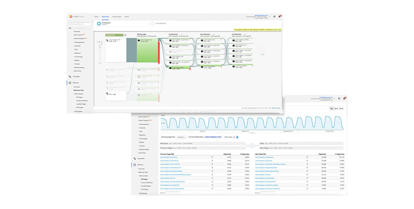
I began by digging into clients historical data, surfacing user pain points and barriers to conversion.
INSIGHT: Users commonly went from the home page directly to the pricing page (pre-disqualifying themselves from the product), the FAQ, or a search. Despite being in-depth, the home page lacked critical information.
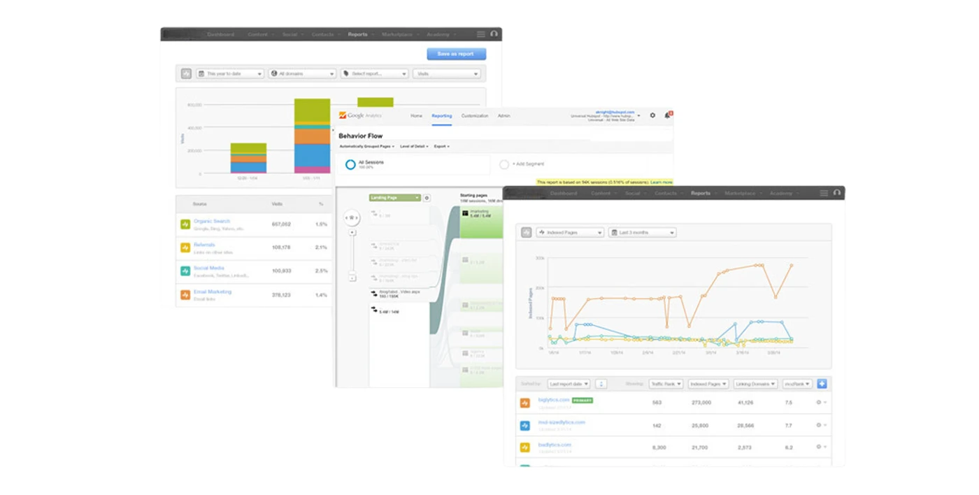
Massive amounts of data were available in Google Analytics, and Mixpanel. The main challenge was sorting through the data and finding meaningful patterns.
Heat mapping
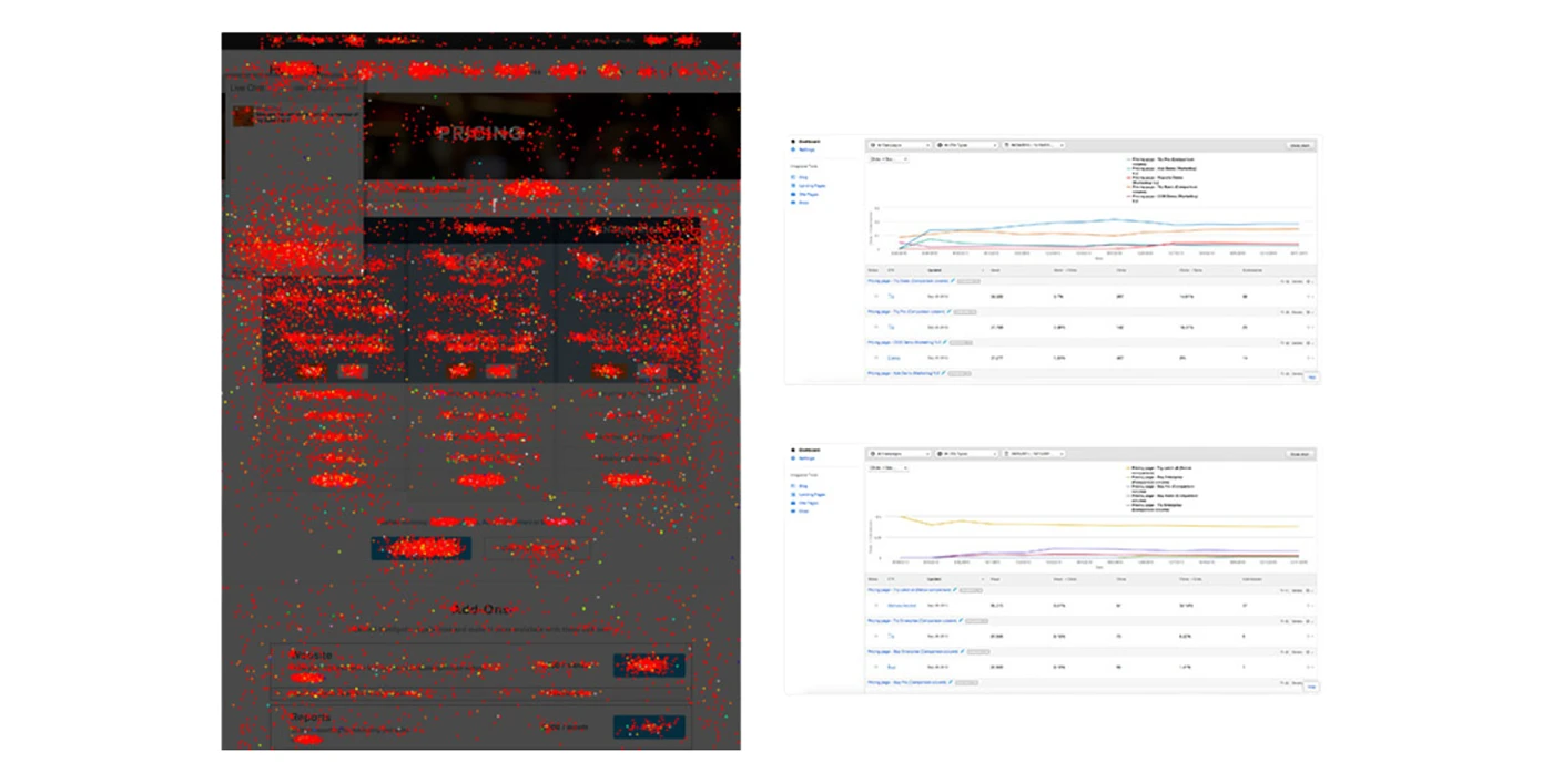
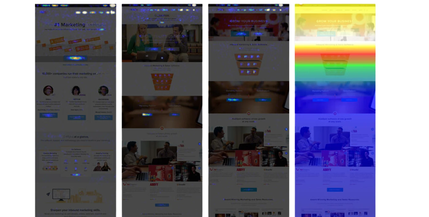
I used heat maps and scroll maps available from their V1 -> To-date. This helped understand engagement on current and previous versions, and the effects that specific changes had.
INSIGHT: At a high level, users weren’t engaging with critical elements and less than 25% would scroll.
These heat maps and scroll maps were run with 25,000 users each, supplying 467,308 unique data points that were analyzed in this project.
Session recordings
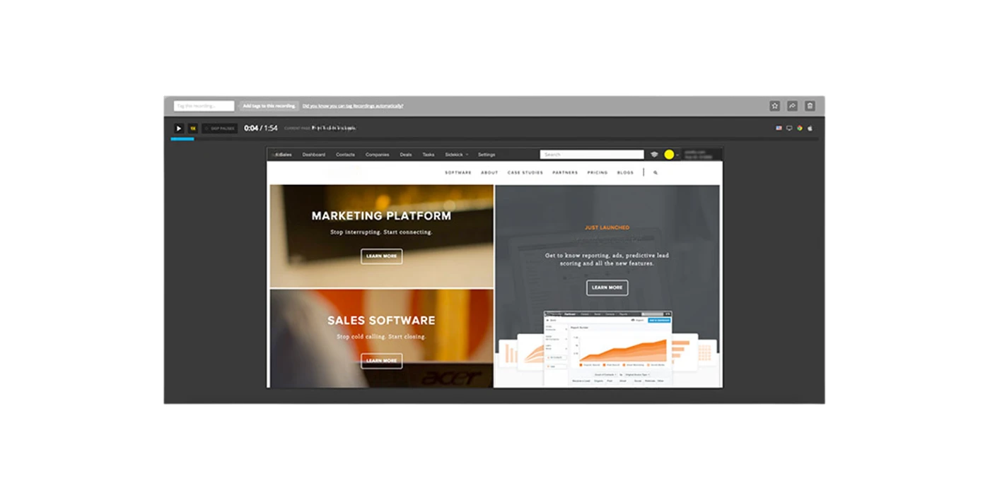
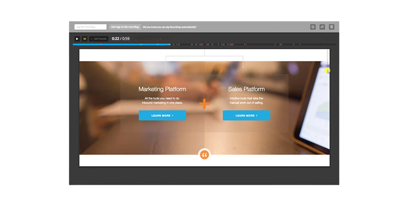
Using anonymous session recordings, I was able to reproduce many of the behaviors found in the Analytics Review, Heat Mapping, and User Testing. This validated hypotheses and identified areas of opportunity for the design.
These live, anonymous, and undetected recordings represented a reliable hybrid qualitative and quantitative data set.
User testing
Qualitative data collection was extremely important in this project, and as a result, user testing was conducted at virtually every phase. Tests were arranged in small, focused sessions aimed at iteration and incremental improvement.
Stakeholder interviews
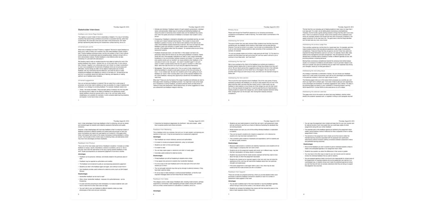
This project drastically affected multiple different areas of the organization, which at times had conflicting interests. I conducted interviews with representatives from Product, Marketing, Sales, Services, Support, and Executive Leadership to understand each part of the company’s unique requirements and concerns for the design.
I collected a lot of internal feedback, cross-referenced it with user feedback, and prioritized design changes.
Customer interviews
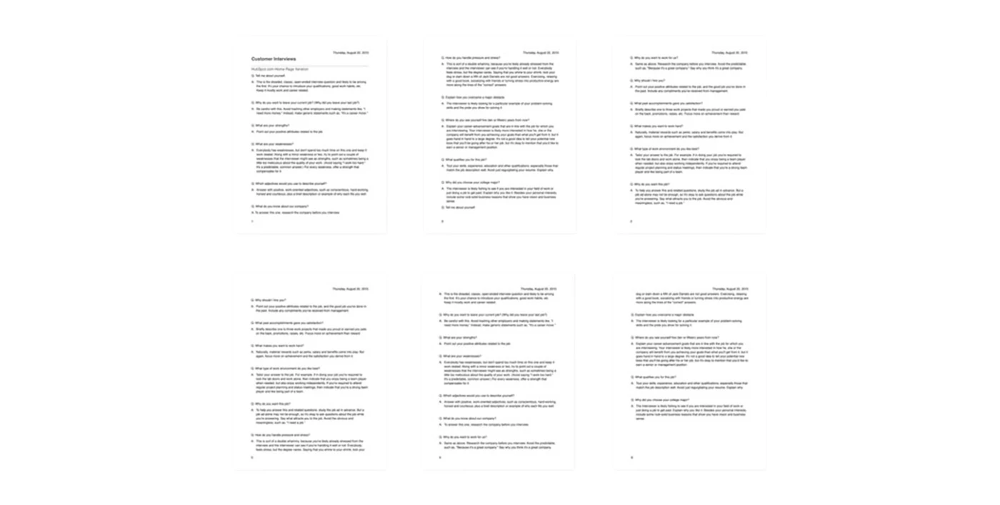
10% of the traffic to the home page of clients website was that of existing customers that were logging into their portals or grabbing important resources. They were very high priority users that weren’t generally taken into account by the KPI’s set for the site. In order to ensure that they were factored into the design, I conducted a set of interviews with customers and used it as the basis for customer-specific dynamic content.
Interviews were conversational and tailored to each customer.
Unsolicited feedback
Client receives a good amount of unsolicited feedback. This can manifest itself in many ways. From support and sales calls, to tweets, to direct emails, and everything in between. I have always prioritized unsolicited feedback for it’s genuine nature and passionate roots.
Users regularly share unsolicited feedback for web properties. This is critical to our research process.
Multivariate testing
The process of honing in on the new design was very iterative. In order to understand what resonated most with the audience, and subsequently qualify or disqualify different elements from the design, I ran tests with different combinations of isolated design changes and saw how users responded.
Wireframing
Once we had a solid direction for the design, I began to produce multiple different variations of wireframes. I then put the designs in front of users and internal stakeholders for testing and feedback. This helped me to narrow the design down to three major variations, which I used to establish a single design framework, and thus move into visual design.
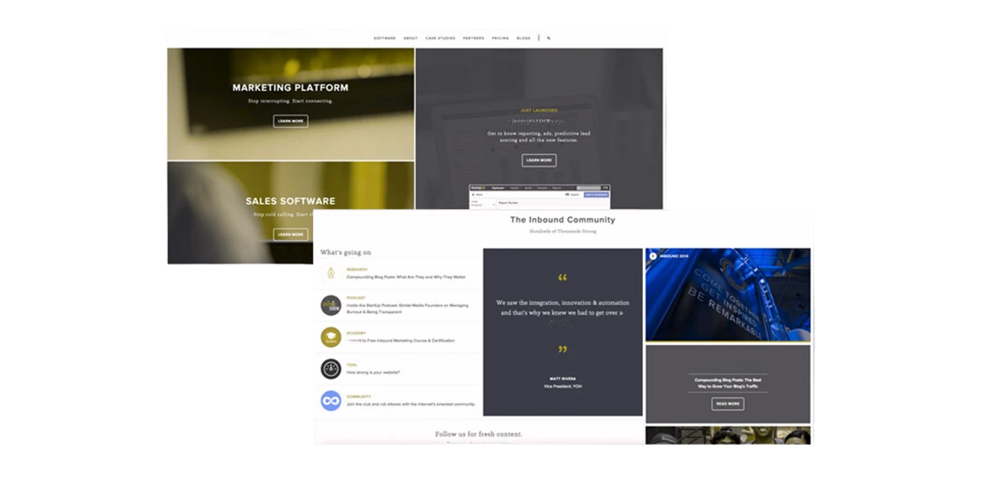
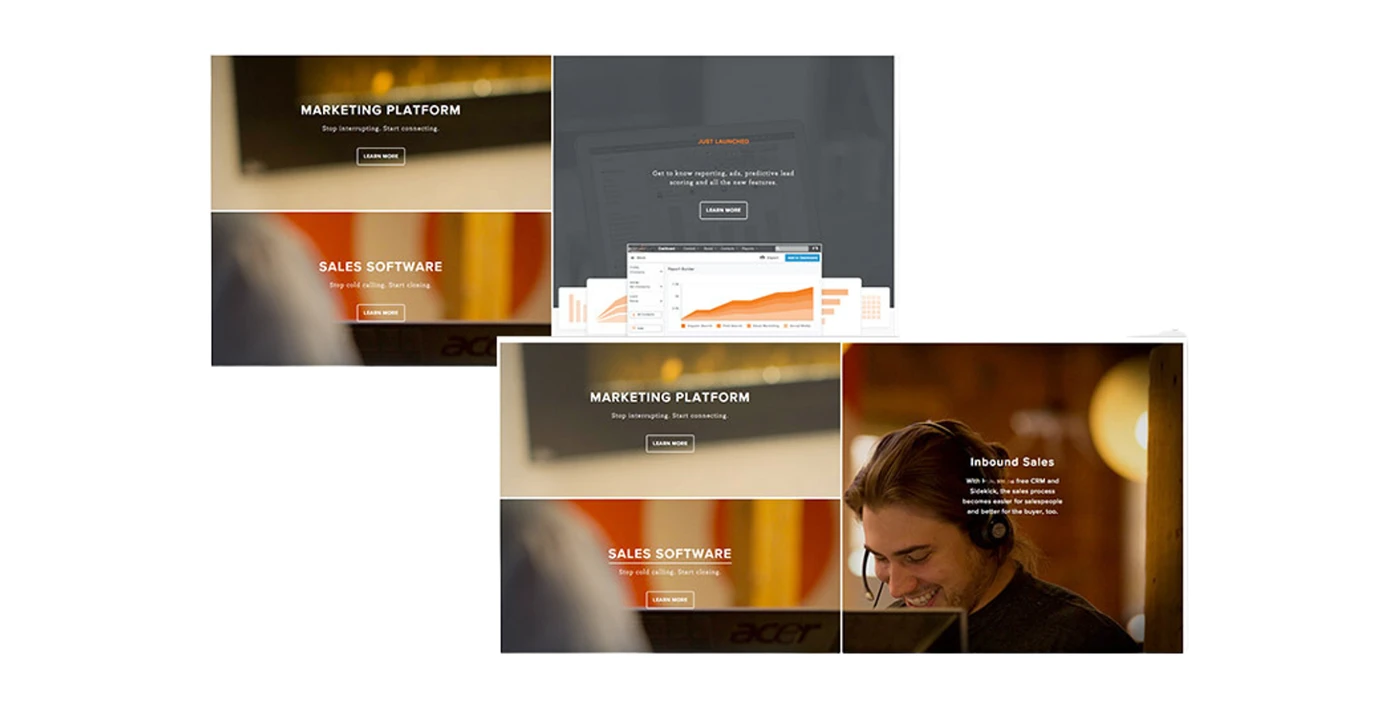
We experimented with a wide array of designs, eventually landing on an atypical, grid-first structure.
UI
During the UI design phase, I used a mix of clean lines, strong typography, bold colors, unique imagery, and an atypical grid structure to elevate the design to a new level.
Scalable & Flexible design
This design needed to be scalable, flexible, and alive. This is one of the primary reasons why i went with such a grid-based, modular structure. It would scale well across devices, content could easily be changed or moved around, and key sections could be updated using a new editorial calendar that we would be introducing.
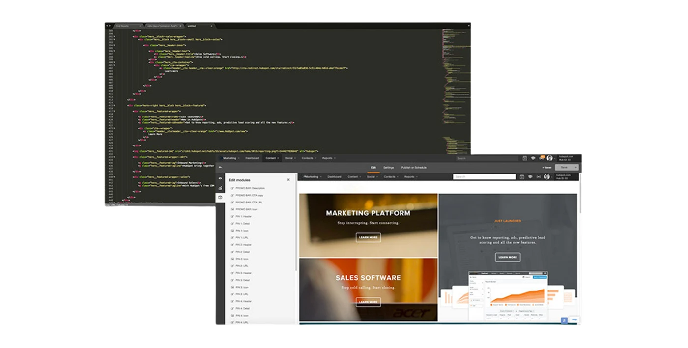
Several editorial sections inspired by stakeholder interviews were built into the design and coded so that marketers could edit them easily.
Interaction design
I used interactions like on/off hover to bring the page to life, draw users into the content, and help confirm user actions. A video plays on mouseover.
Thoughtful repurposing of space was very important in this design and something that users specifically noted in testing.
Dynamic content
As a way to deliver highly relevant content to each user and solve for specific user groups like existing customers, we developed dynamic content sections that would adapt based on the user. These were then tested within the context of personas and purchasing stages.
INSIGHT: Earlier in the project, interviews with existing customers identified personalized content as a major opportunity.
Accessibility
Over 19% of the U.S. population is disabled. Accessibility and device compatibility were crucial to all of clients users. The design needed to perform across multiple different devices by utilizing a fully responsive design and stable code. This code would then need to hold up well in devices built for accessibility purposes, like screen readers.
Using an array of accessibility-focused tools, I tested the design for multiple forms of color blindness and compatibility with screen readers.
Simulation of Red Green Colour Blindness
Internationalization and Localization
As a global company, Client required an equally global site. In addition to English, the new pages would also be translated into Spanish, Portuguese, German, French, and Japanese, with additional languages to come in the future. This was an important factor in the design, as foreign translations could potentially take up 100% more space than their English counterparts.
Collaboration with Devs & QA's post Design
To check whether design & Interactions are compatible across all devices or needs any break changes.
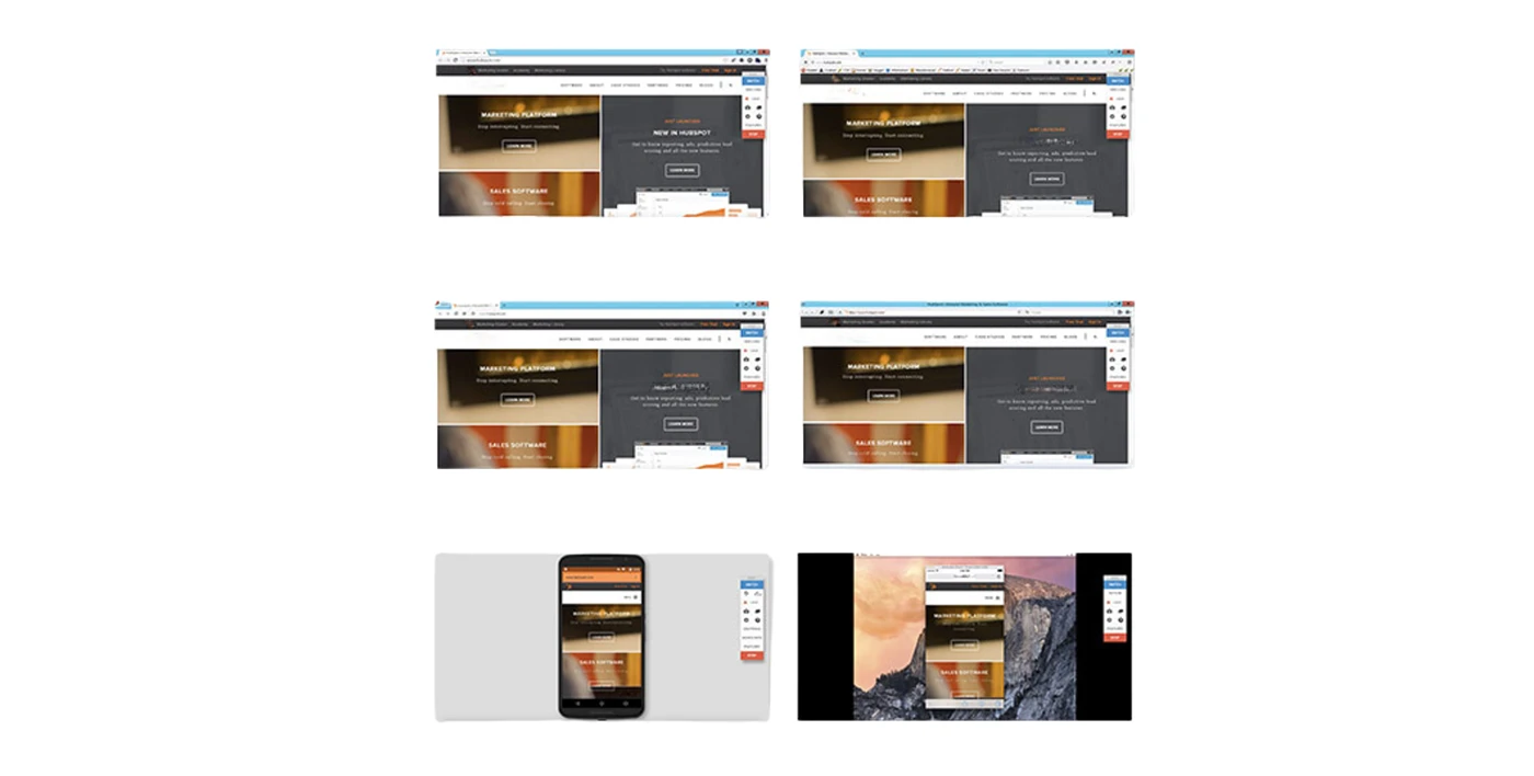
The design needed to display consistently across browsers and devices (including some that were utilizing outdated technology). Using BrowserStack, QA emulated the site on real devices. Knowing that our users were 73% in Chrome, 12% in Safari, 9% in Firefox, and 5% in Edge, we prioritized fixes according to audience size and criticality.
The design was tested across devices and resolutions in multiple versions of Chrome, Safari, Firefox, Edge, Opera, and Yandex.
Collaborating with PM's post Design
Each page affected in the iteration had a set of Key Performance Indicators that I monitored and tested against with PM's. I paid especially close attention to Conversion Rate, Submission Rate, Drop-Off Rate, Event Triggers that we built into the design, Goal Completion, Navigation Summary (Origin page and Destination page), and even specific Search Queries.
Google Analytics provided a wealth of historical data that could be compared in Behavior Flows and Navigation Summaries.
New Design Conversion performance Check
Every Call-To-Action button in the design would track views, clicks, and submissions for every button. This data was then rolled up into user profiles and larger reports that helped us gauge how the design was performing.
CTA’s could be tracked throughout a user’s lifecycle, helping us to understand where and when they were converting.
Heat mapping
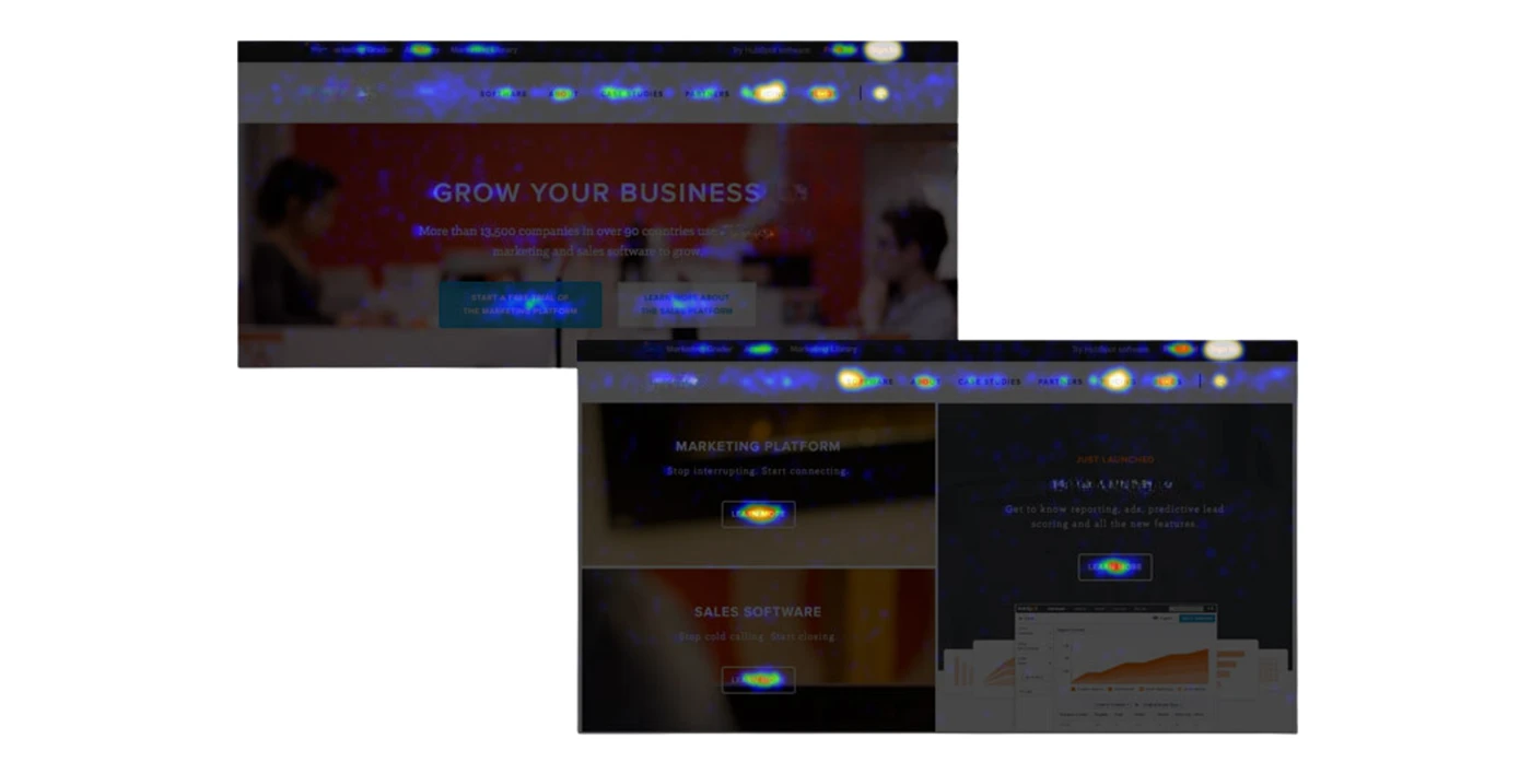
Through multiple rounds of heat maps with 25,000 users each, I was able to observe how users were engaging with the design, where engagement had increased, and where it had dropped off. We saw major engagement increases in critical CTA’s, navigation elements (like the software tab), and application links (like the free trail conversion link).
Heat maps helped to show where the design was performing well and identify opportunities for iterative tests.
User testing and recording
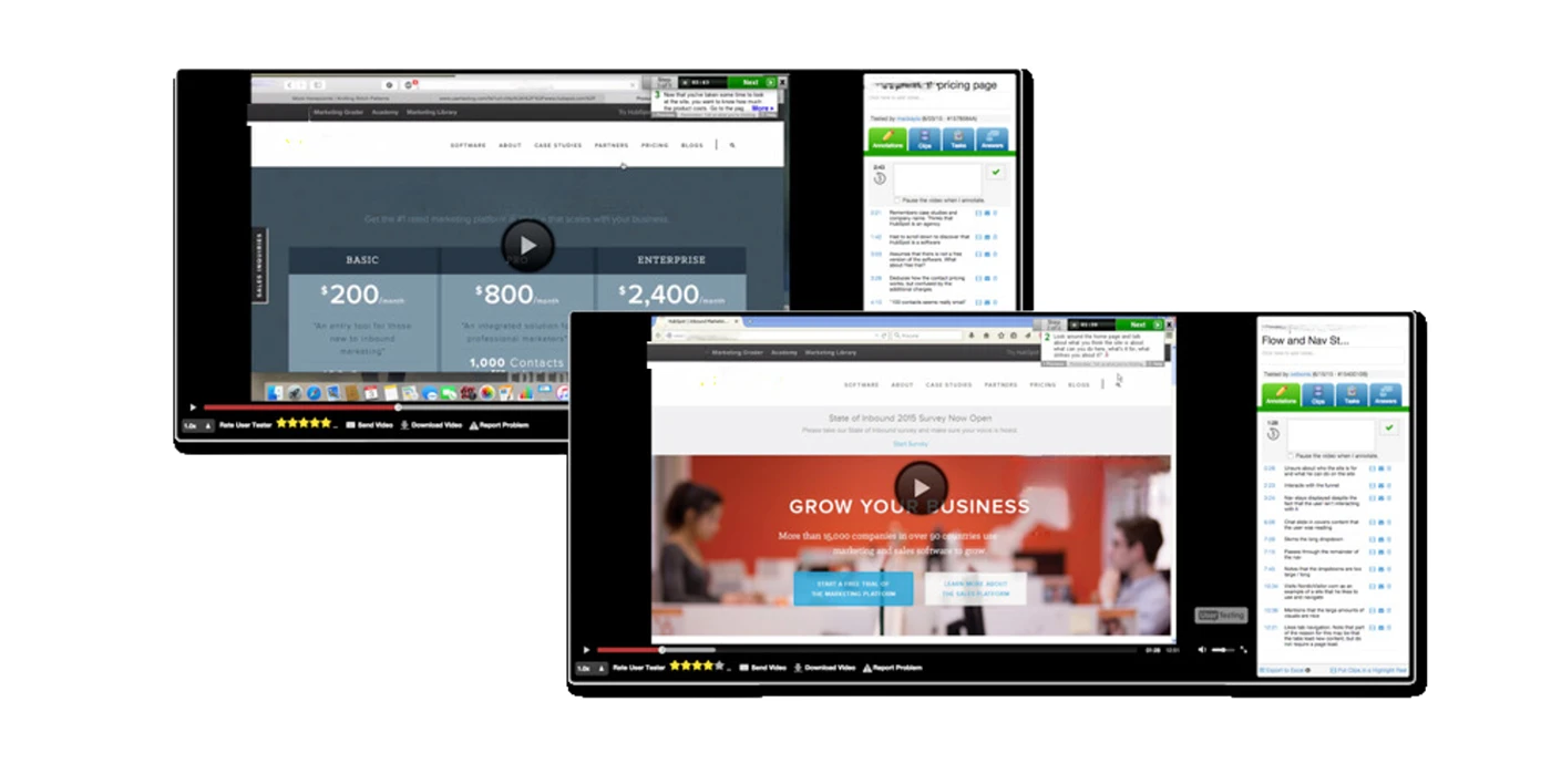
With the design live, I recorded users on the site and ran additional rounds of user testing. This really helped to give us ideas for elements to test and ultimately incorporate into future iterations of the design. This information was very easily paired with quantitative data and used to prioritize the most important items for the next iteration.
Screen recordings were used to immediately assess the design. In this case, I was watching how an existing customer used the site.
Lessons to self till this points
This was a high impact project. A lot went right (thanks to data), but as with any project, things also went wrong. I like to reflect on the successes and failures of every project so that I can learn from them and apply those learnings in the future.
I could have been more efficient by setting a more explicit scope and continually refocusing our stakeholders on the project goals. As the project neared completion, the scope seemed to increase dramatically with new ideas and “nice to have’s” that weren’t always aligned with our original KPI’s. This put a lot of pressure on me to deliver additional work that may not have even solved for our goals.
Applying the full Lean UX process that I implemented, and seeing how big of an impact it had on the team and the end product that we built feels like a second life.
Next Sprint after taking V1 feedback
I measured conversion not by clicks or sign-ups, but by activated and retained users.
Every decision has been justified using research and KPI’s, rather than just opinion and intuition.
Every task was stack ranked against these goals, using the criteria of potential, importance, and ease.
Sprint Kickoff
I'd source opportunities from the core team, stakeholders within the business, and ongoing performance analysis. They were all accompanied by data and cross-referenced with goals established. These were used to build the business case, flesh out the iteration, and set it in motion.
To support this, we used a hybrid data model tracking users across Google Analytics 360, and Amplitude. We didn’t make guesses; we attacked the best opportunities.
Planning
JIRA epic and Kanban board were created.
Design
Documentation: wiki space is created to document ongoing learnings
Research
Once the iteration was established, research would become the primary focus. This was both an ongoing and an iteration-dependent process.
With over multiple pages across the site, detailed conversion flow audits helped identify areas where the experience could be simplified.
Simple flows had a 2-3x higher conversion rate than their complex counterparts. A new, standardized “Get Started” flow helped users convert in 3 steps from anywhere.
User Journeys
By looking at individual user journeys, we uncovered issues where users were wrongfully converting, getting lost in the site, and abandoning products that they signed up for.
In one such case, a new conversion and sign-in interface was created. It detects known users even if they aren’t signed in and offers to continue with their account instead.
like Sign-in with Google pops up in Progressive webApps
Learning unobvious User Behaviours
Using a composite of data sourced from interviews, user tests, and surveys, we kept a pulse on how prospects preferred to learn about new software products.
-In one instance, users indicated that they wanted to watch a video or read through a website, and that chat was least favored. At the same time, our conversion data consistently showed that chat had a high close rate.
After considering both quantitative and qualitative data sets, and reconciling areas where they contradicted each other, we developed solutions that prioritized video-based and story-based learning, as well as a new chat experience. Users didn’t dislike chat in general; they disliked our chat. These videos increased conversion by 300%, and chat volume increased by 38%.
Conversion Motivators Discovery
User interviews and surveys would help uncover the messaging that spoke the most to prospects, and was later cross-referenced with copy vs. copy testing data.
Copy was centered around product-descriptive, “all-in-one”, and “growth” themes. In copy vs. copy tests, changes to messaging improved conversion by 20%.
Experimenting design changes every week in production
An average of 10 experiments were launched on the site every week. The learnings from these experiments continually impacted our incremental growth metrics.
After KPI’s were tracked and proven out for each experiment, their learnings are applied across the site. This simple scaling effort bled into design, research, and code.
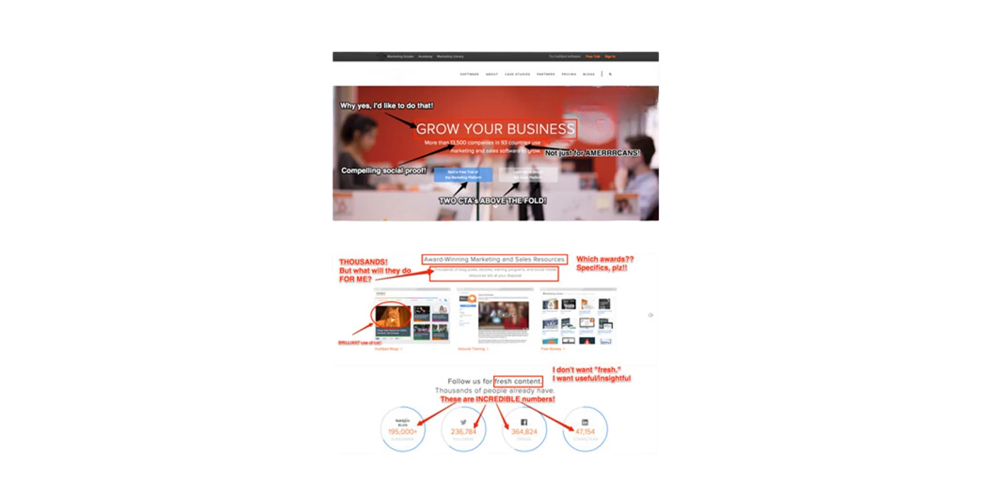
User testing and session recordings
were regularly run to observe organic user behaviors, check the health of the experience, and qualitatively test against hypotheses.
Results were compiled into feedback docs and stack ranked quantitatively in Rainbow Spreadsheets. These were then mapped to action items for design and development.
Heatmapping
Heatmaps, Scrollmaps, and Color Blindness Simulations were used to evaluate the effectiveness and accessibility of the design, as well as how users interacted with it.
Pre and post launch heatmaps helped predict design performance. On the left is a heatmap of a pre-launch static PNG. On the right is the post-launch live design.
Presentations with Key Stakeholders
As fresh research was completed and used to jumpstart a new iteration, I placed into a kickoff slide deck that I would eventually present to key stakeholders and decision makers. From this, we'd agree on the direction of the iteration, the timeline and the team needed to carry it out. We didn't iterate for the sake of iterating, so this was part of the process helped us evaluate each iteration.
Leading with UX Writing
Research determines content, and content determines design. In that order. This is what drove our research-first and copy-first approach to design.
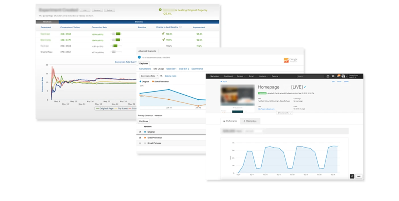
Research Copy & Data ----> Raw copy & Story Structure
Raw copy & Story Structure -----> Near final copy in Pre-made modules
In-depth messaging research was matched with specific verbiage and used to construct full copy docs, which went through several rounds of feedback and iteration. As the copy began to solidify, it would be placed into a rough structure to visualize how the story would be told. During this time, design exploration was also under way, working in conjunction with copy.
Exploratory Design
I produced this design and we had it live in 24 hours. It converted 20% better than the control, even as a quick experiment. This indicated that our hypotheses were aimed in the right direction. Got 20% increase in conversion rate. That justified an iteration.
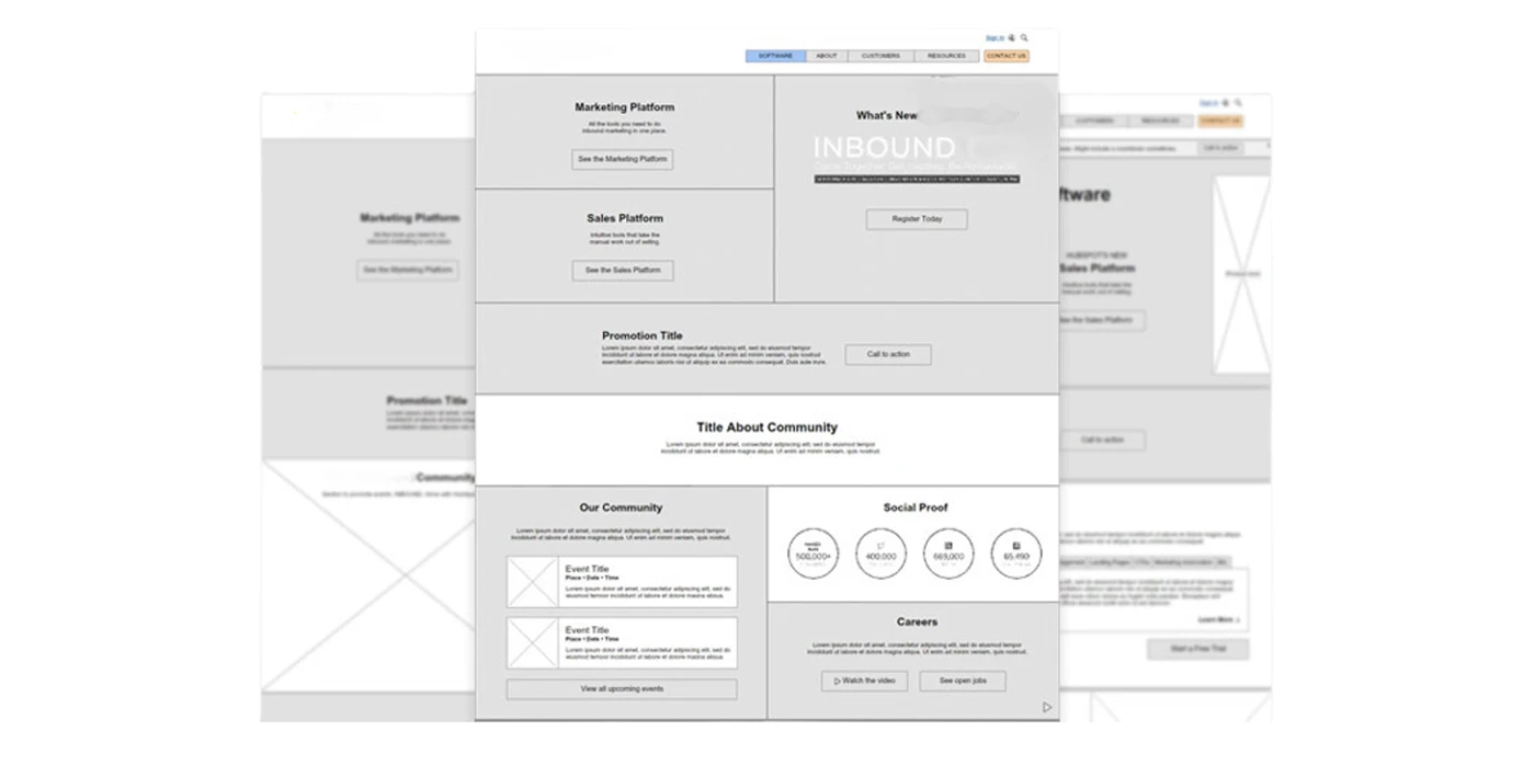
Testing and validating elements
I maintained several Design System Boards with elements that I pulled from around the web, concepted in meetings, or drew during a moment of inspiration. We regularly implemented these elements as tests and enhancements. Importantly, each core element was quantitatively and qualitatively validated before implementation, no matter how subjective it may have seemed.
Wireframes & Mockups
As the design direction was established, I began creating the structure and hierarchy of the design
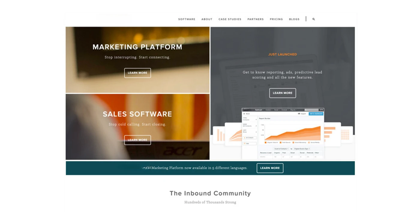
Pricing Page
Product Page
Snapshot from our weekly meeting, covering key metrics and experiments.
Page - Summary of Changes - Signups- conversion percentageof positive/negative changes
Google Analytics 360 and Amplitude were used to collect data, which was then compiled in Google BigQuery and used to populate custom visualizations that were built in Google Data Studio. This allowed us to see data across the entire site and product, and focus exclusively on metrics and questions that were relevant to our work. Using a predictive analytics model that was laid on top of this data, we were able to measure conversion not by clicks or submissions, but by user retention and revenue. This was tracked across more than 90 unique conversion journeys throughout the site.
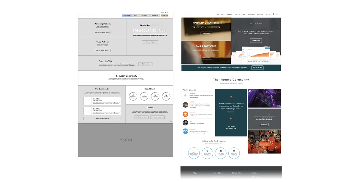
User Preferences over Team Preferences
Over personal preferences; we tested aesthetic directions with actual users and quantified the best aesthetics.
From my point of view, the fostering of this approach was one of the biggest wins for this project.
PROJECT ARTIFACTS
The screens and process, brought into the case.