SOURCE-BACKED CASE STUDY
Cutting clinical task time 90%, scaling a health platform 10×
Project context
Cutting clinical task time 90%, scaling a health platform 10×
40% workflow streamlined
90% user satisfaction
Challenge
Client has assigned Quality Data Managers (QDM) and Quality Data Analysts (QDA) to oversee efficient operations in all facilities, ensuring quality, affordable, and efficient patient care
What is the Tool?
The Clinical Trail Tool streamlines facility monitoring, allowing Quality Data Managers to focus on maintaining quality and efficiency across all Client facilities, saving time and resources.
This transformation Tool consolidates data entry, clinical action plans, and reporting, reducing staff stress and burnout while ensuring a quality patient experience.
My responsibilities have been
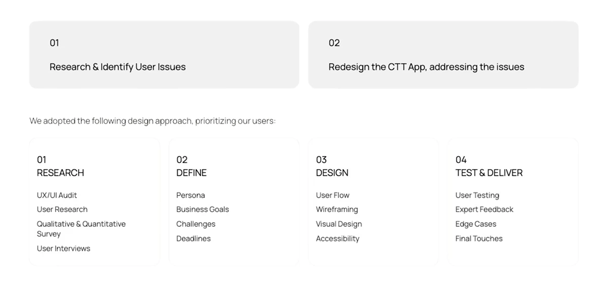
Interviewing users and creating personas to ensure our design met real-world needs.
Conducting surveys to understand user insights and guide our design decisions.
Collaborating with stakeholders to create wireframes following agile practices.
Validating wireframes using design thinking principles, think-aloud, and A/B testing.
Challenges
The new roles required extensive manual work with numerous Excel files.
Digital intervention was necessary to streamline the process.
This trail tool was at an infant stage and didn't provide much value
Interface needed to be scalable for the growing virtual care demand
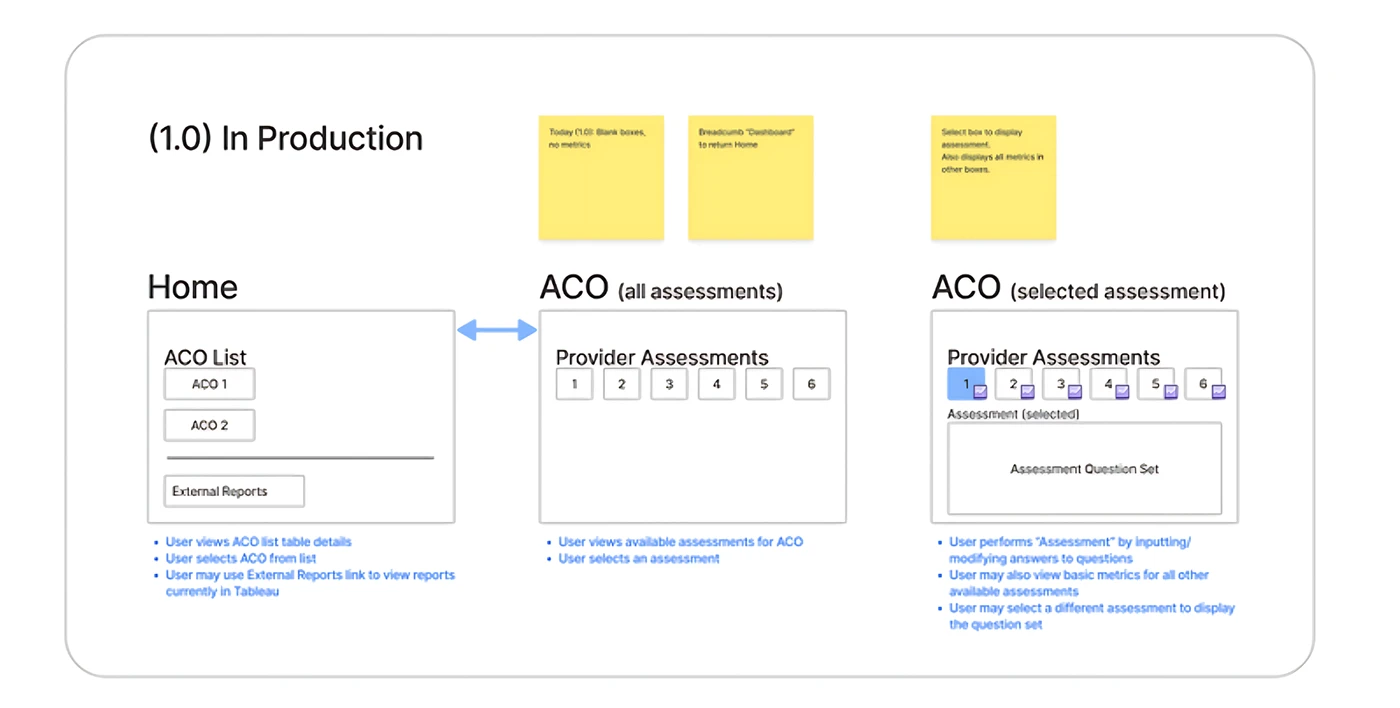
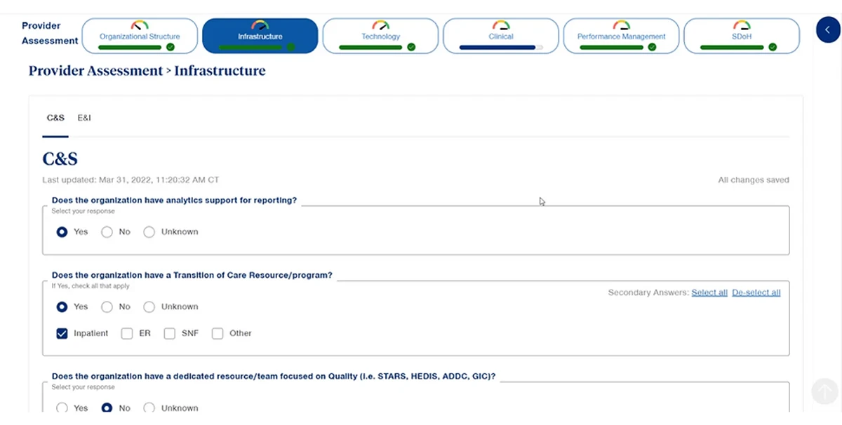
v1.0 had basic data entry and parameter assessment but fell short due to limited functionality and technical glitches.
kicked off with a UX audit: of v1.0
v1.0 AUDIT INSIGHTS
The UI was took up a lot of scroll space, leading to navigation issues.
The functionality was too limited, with not much to do besides data entry.
The pillbox-shaped tabs occupied excessive screen space, especially considering the need to add more tab rows later.
The design required greater compactness and streamlining for user-friendliness and scalability.
Business Objectives
Addressing challenges in new Quality Data roles.
Streamlining clinical data management processes.
Focusing on automation for increased efficiency.
Elevating patient care through improved tools.
Survey
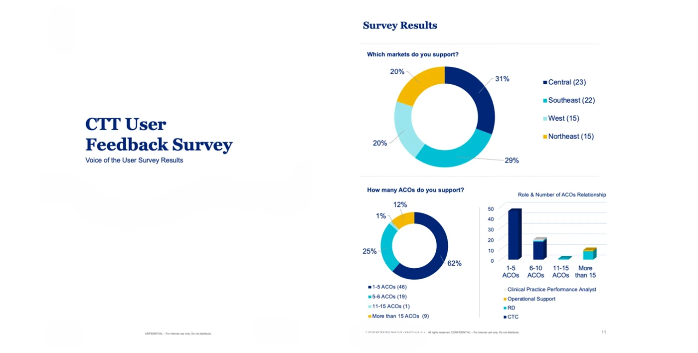
Clinicians work, their tool habits and challenges to get insights on user needs and what pitfalls to avoid, which guides future design decisions...
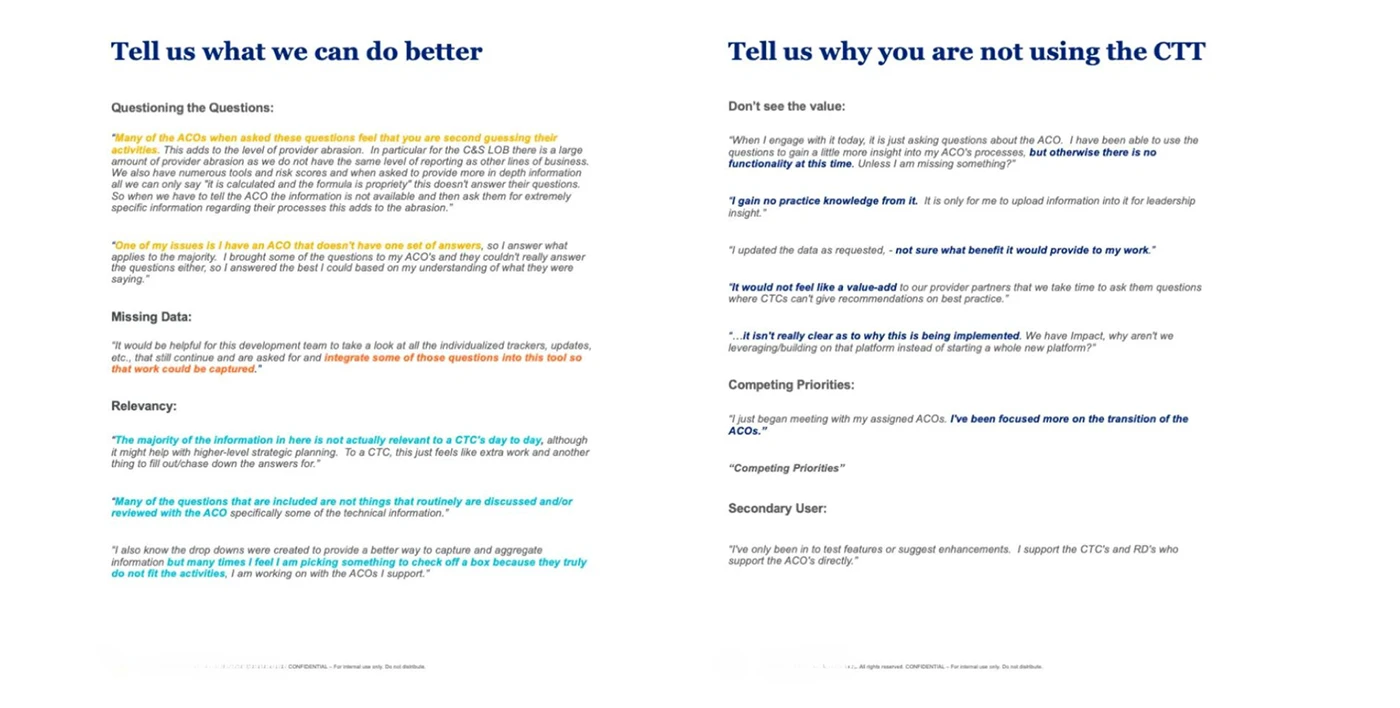
Users' open-ended feedback provided deeper insights into their thoughts, concerns, and suggestions.
Evaluated response rates, demographics, NPS, and satisfaction to understand user experiences systematically.
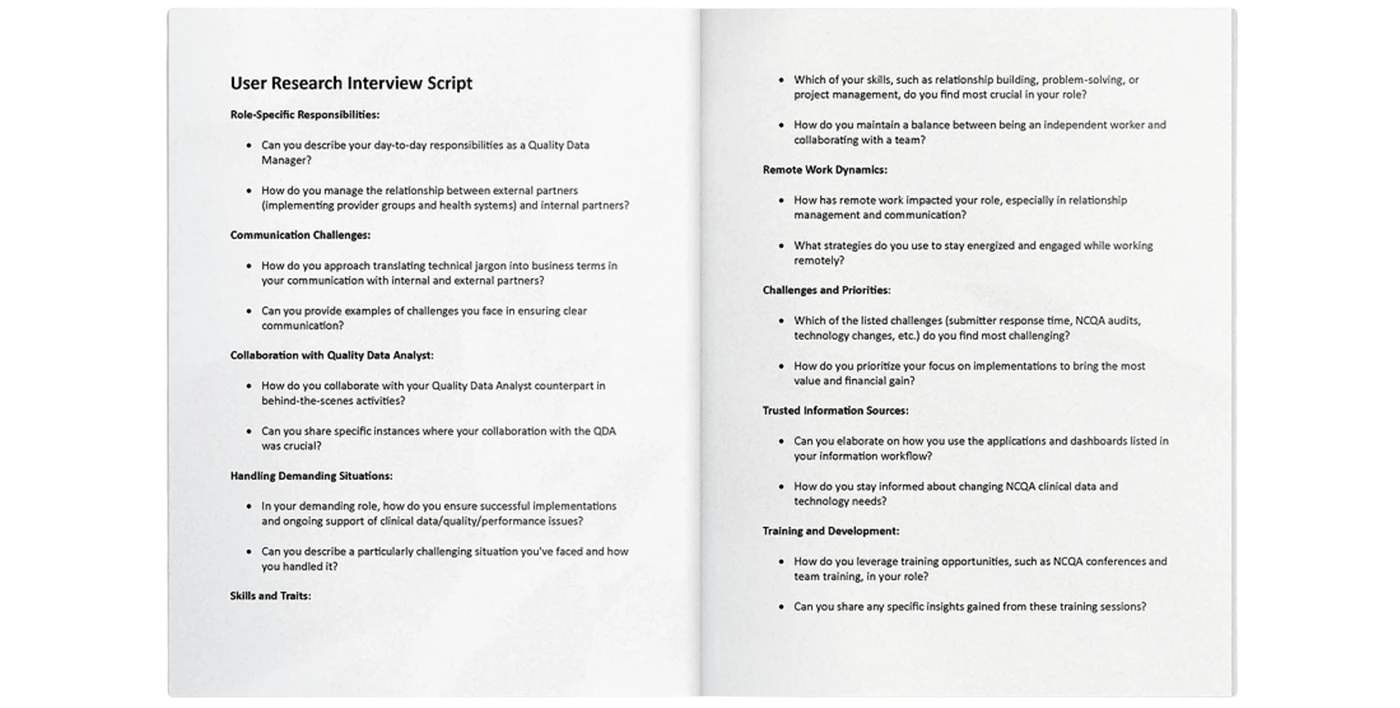
Mapped Persona
Shadowed key roles
Storyboarding of 2 key roles
Created storyboards for 2 key roles using interview insights.
Quality Data Manager & Qualiy Data Analyst
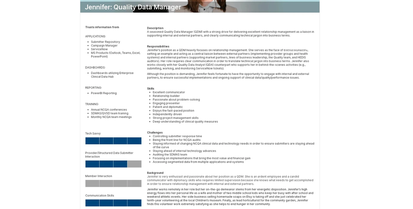
Quality Data Manager
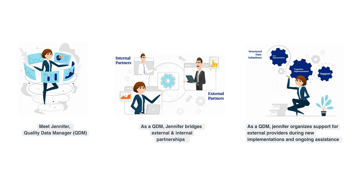
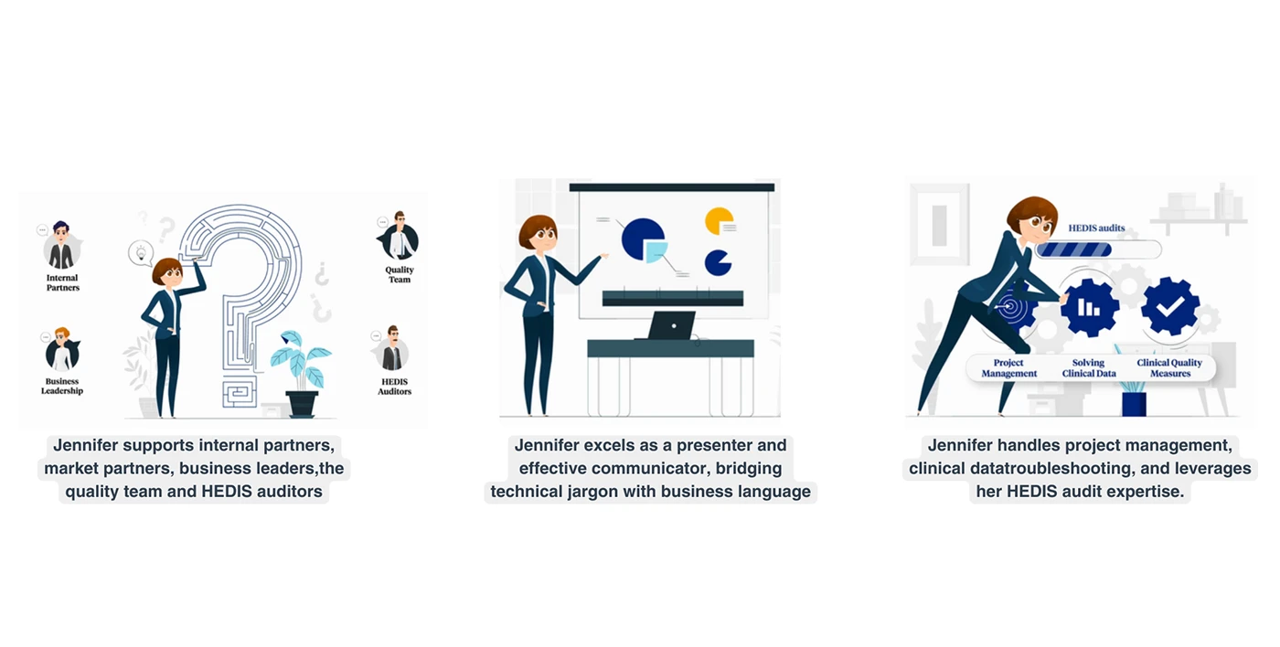
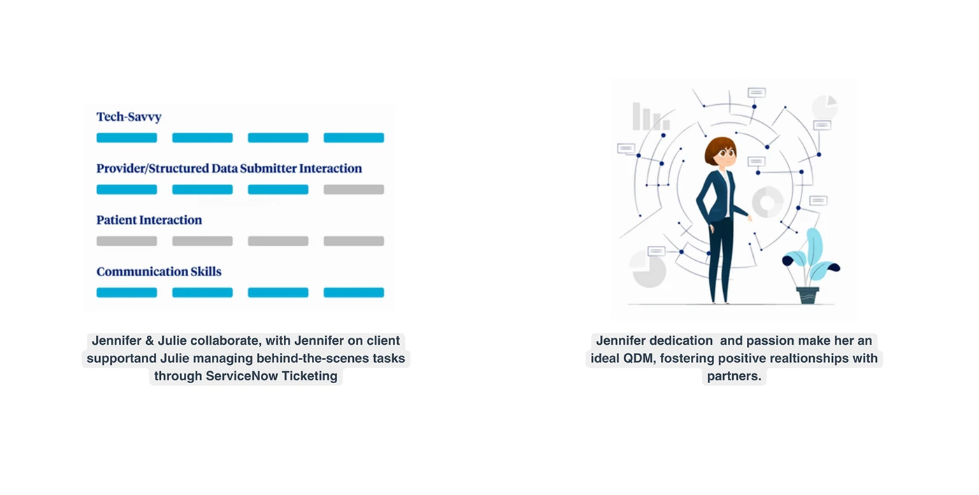
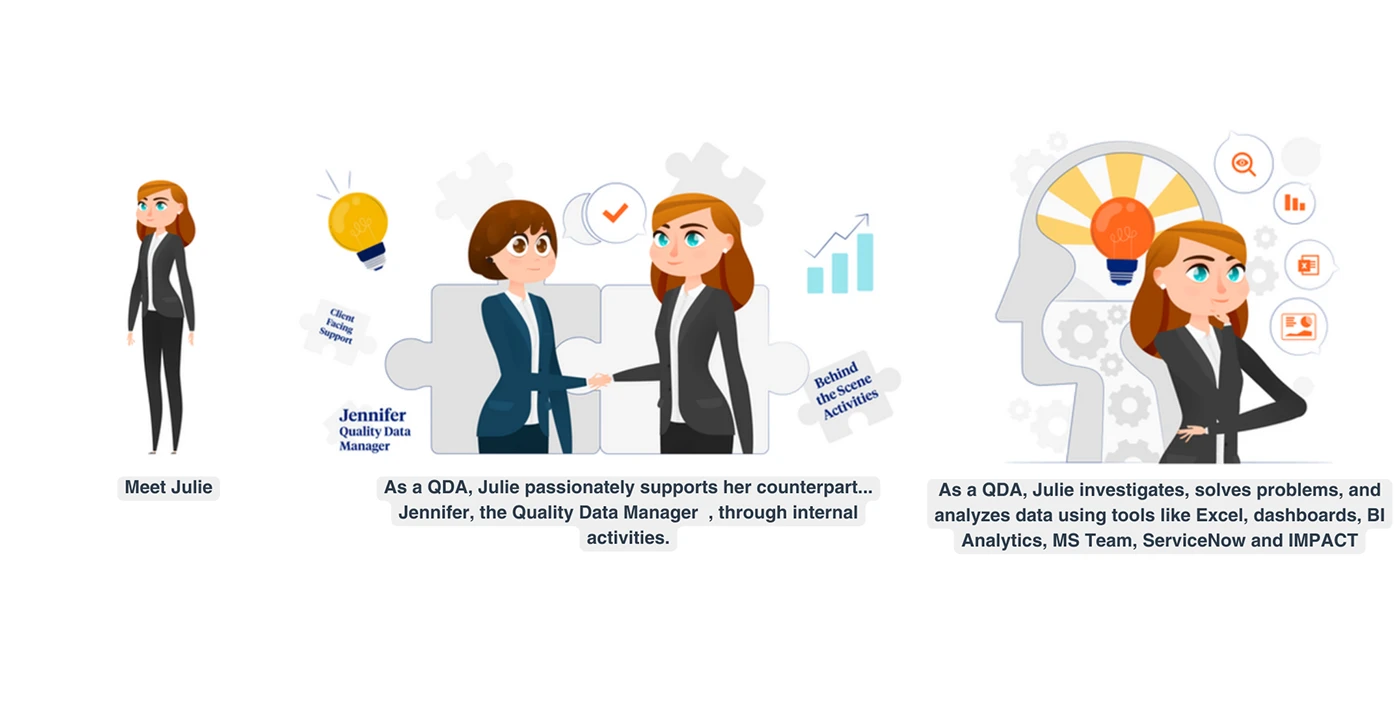
Jennifer applies problem-solving skills and tech expertise, navigating quality management and clinical data intricacies.
Quality Data Analyst
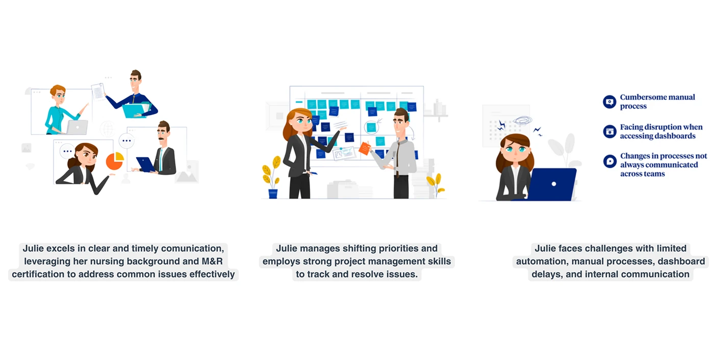
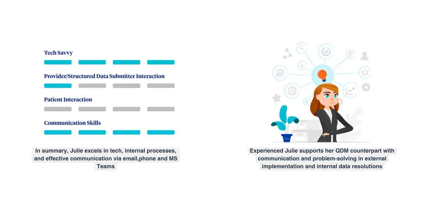
Julie passionately supports Jennifer with strong analytical and problem-solving skills in healthcare data analysis and internal support.
Key Pain Points
Manual Maintenance: Manage heavy manual efforts due to limited automation.
Segmented Data: Challenges in accessing data from various applications.
Audit Responsibilities: Oversee audits for the demanding SDMAS team.
Strategic Implementations: Prioritizing for maximum value and financial gain.
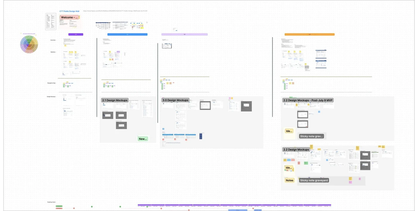
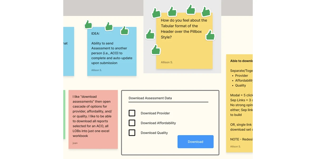
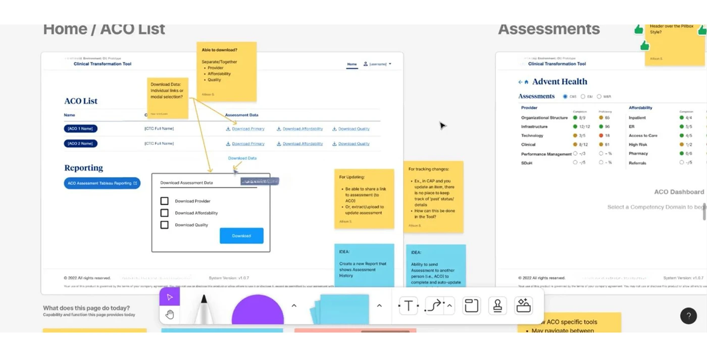
Used FigJam as a common ground to discuss and test prototypes, guiding the best approach forward.
for stakeholders, developers, and users to shape the tool.
This facilitated instant feedback, crucial for iterative improvements in Wireframe Design.
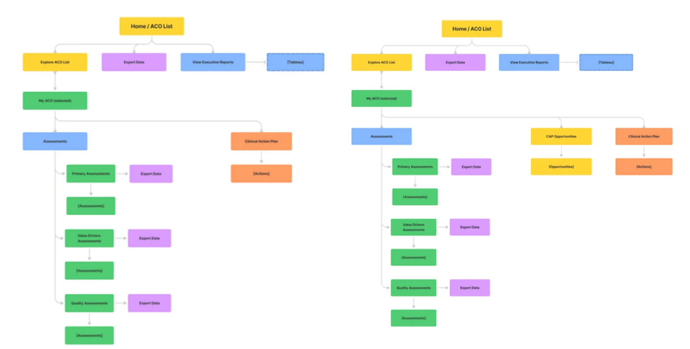
I have reviewed user flow sketches in Design meetings, collaborating with stakeholders.
The Design Wall empowered users with post-it voting for a democratic design process.
Instant Feedbacks
Gathering instant feedback from stakeholders and users for iterative improvements.
Validating User Fllows
Reviewed user flows in our weekly Design meetings, collaborating with stakeholders.
I tested multiple layouts for the reporting screen. The list-style layout (2) was finalized for its simplicity and resemblance to how QDAs manage data in Excel files.
Here are some design approaches that served as the foundation for the whole system redesign.
1. Removing excessive graphics
Clinical Trail Tool consolidates complex functionalities under one system, requiring a ground-up UX/UI redesign for scalability and future feature integration.
Before
Graphic elements, like the pillbox tab menu, and space-occupying elements caused clutter, hindering comprehension.
After
The new design introduces a cleaner look, improving compactness and enhancing readability with a color-coded tab system.
2. Designing a space to monitor and track
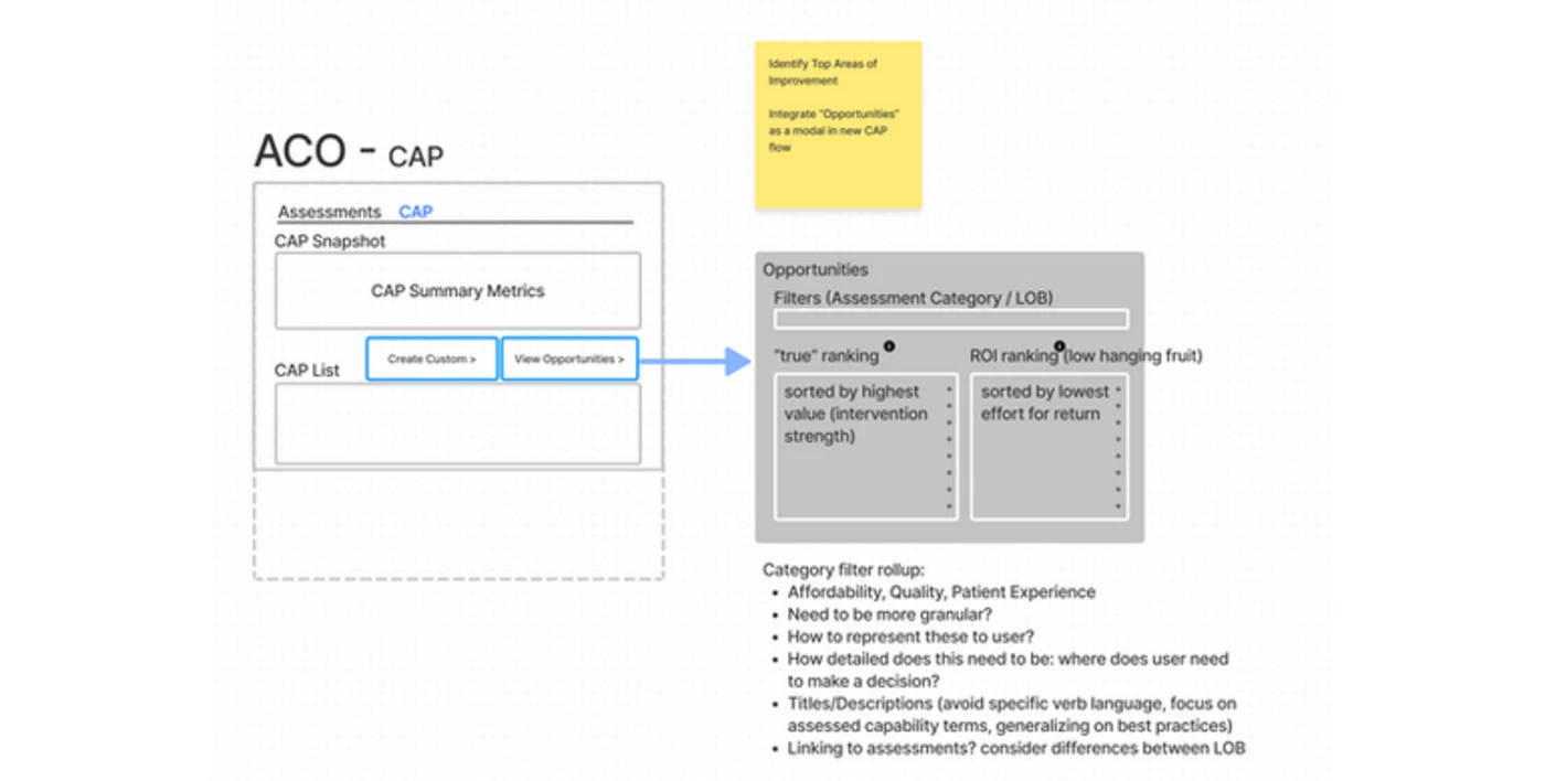
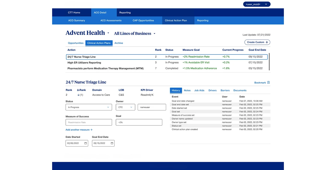
I crafted the whole system from scratch, with the Clinical Action Plans Page being a standout. We listened to users, giving them a hassle-free space to manage action plans all in one spot.
The page lets users create or choose action plans, easily tracking changes, adding notes, attaching docs, and more.
Before
The old workflows were a pain. Dealing with multiple Excel files for data was a stress-fest, making it tough to stay focused.
After
I checked out how QDAs handle data and pitched a fresh dashboard for report monitoring.
Using visual data makes it easier on the brain, processing images faster than text.
This change was driven by our pursuit to achieve two business objectives
- For experienced users: quick access to their most-used features.
- Beginners: simplifying and speeding up the learning process.
We dug into the Design Wall's insights, figuring out what users love most. Shortcuts for quick access to favorite features? Done. Plus, they can create their own shortcuts – easy peasy.
The home page sets users up with quick alerts and lets you create your own bookmarks for easy access to their favorite sections.
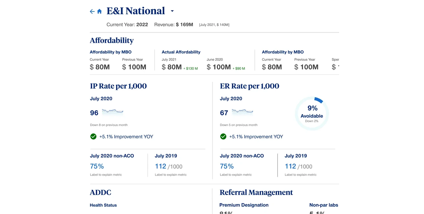
Clicking on the facility brings up a detailed summary section with interactive widgets, allowing users to perform functions instantly.

Final Designs
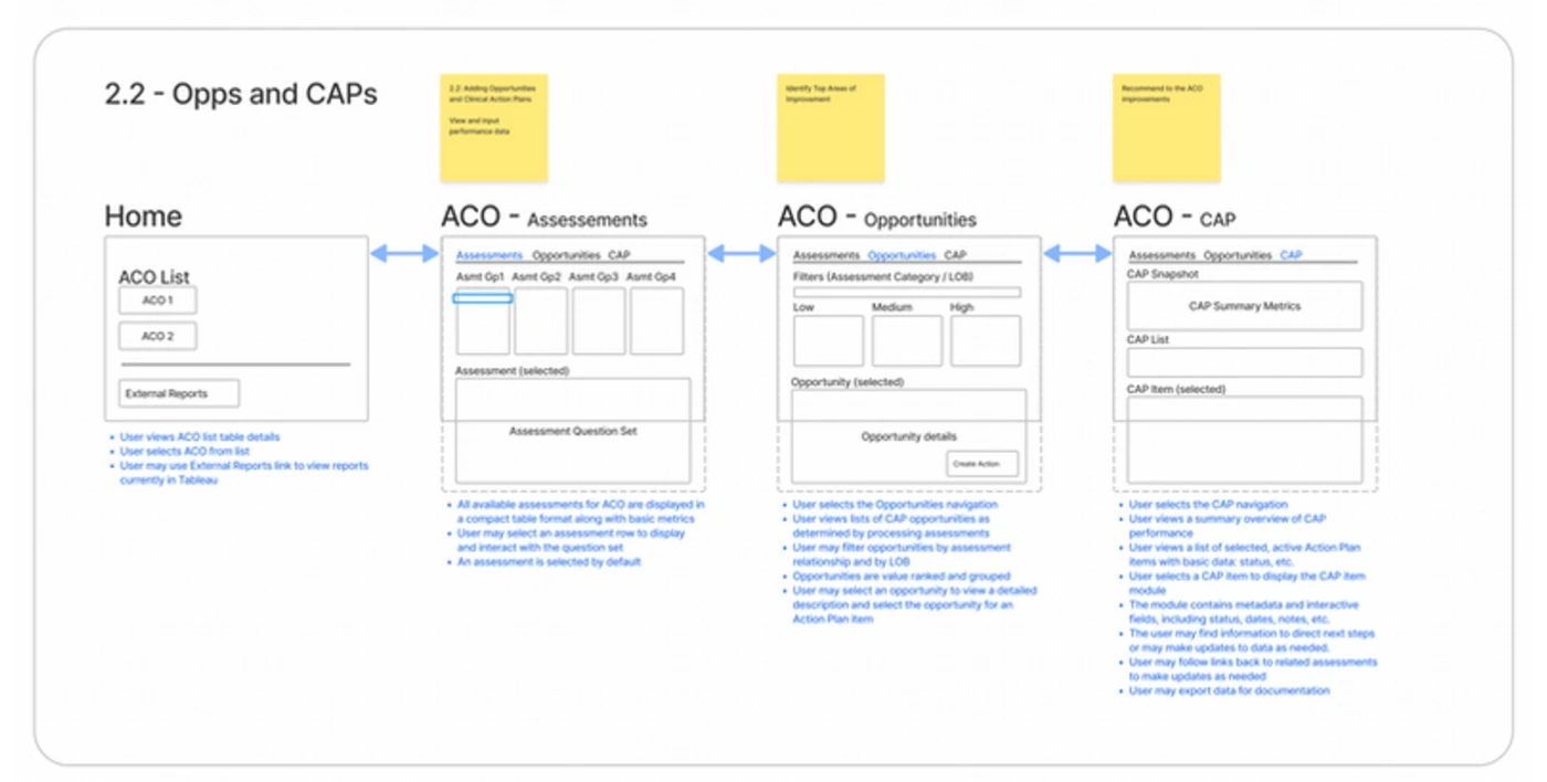
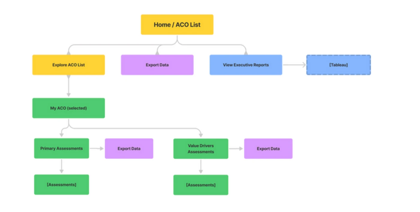
Site Map
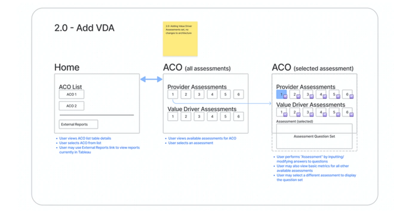
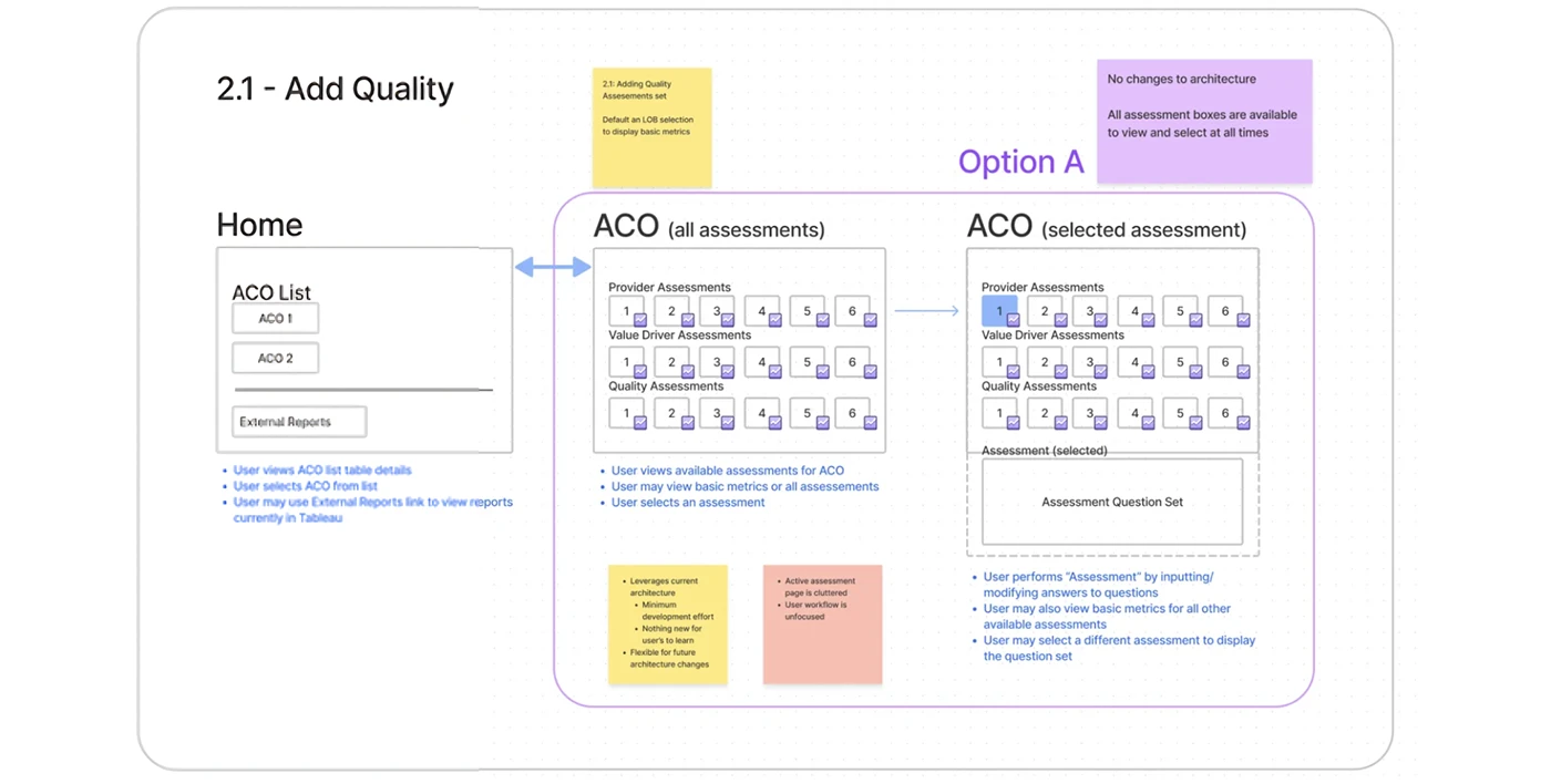
Choose a UHC facility (ACO) from the list on the Home Screen to perform various functions.
Home
A central hub for users to navigate UHC facilities (ACOs) and perform tasks.
Before:The V1.0 homepage had listed ACOs with an option to just download reports.
After
Summary:A quick overview of all sections for the selected ACO.
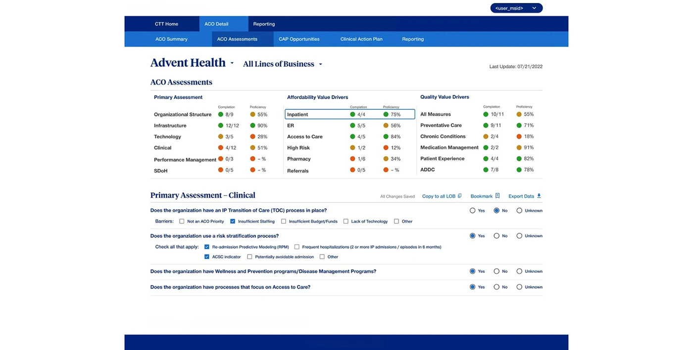
Assessments: Evaluate selected ACO's infrastructure, technology, performance, and more.
Before:The original interface had distracting elements that needed cleaning up.
After
Opportunities
Explore best practices to enhance ACO performance.
Clinical Action Plans
Manage and track.
PROJECT ARTIFACTS
The screens and process, brought into the case.