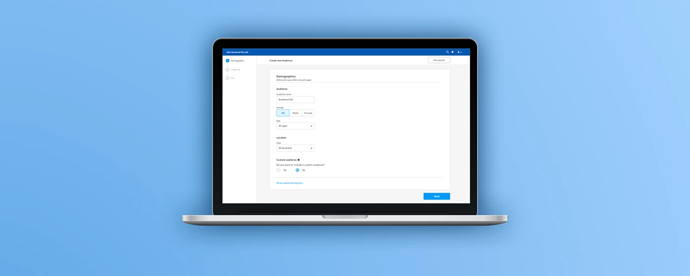
SOURCE-BACKED CASE STUDY
B2B Application redesign
Project context
B2B Application redesign
Overview
To redesign of its entire B2B application with the vision of becoming the best ads management platform
The goal of this particular project was to identify any usability issues with the beta release and determine the critical features to prioritise for the next iteration of the product.
Background
Client is a Australia-based internet marketing company that connects businesses to their customers through the customer buying experience.
The process
Understanding the problem
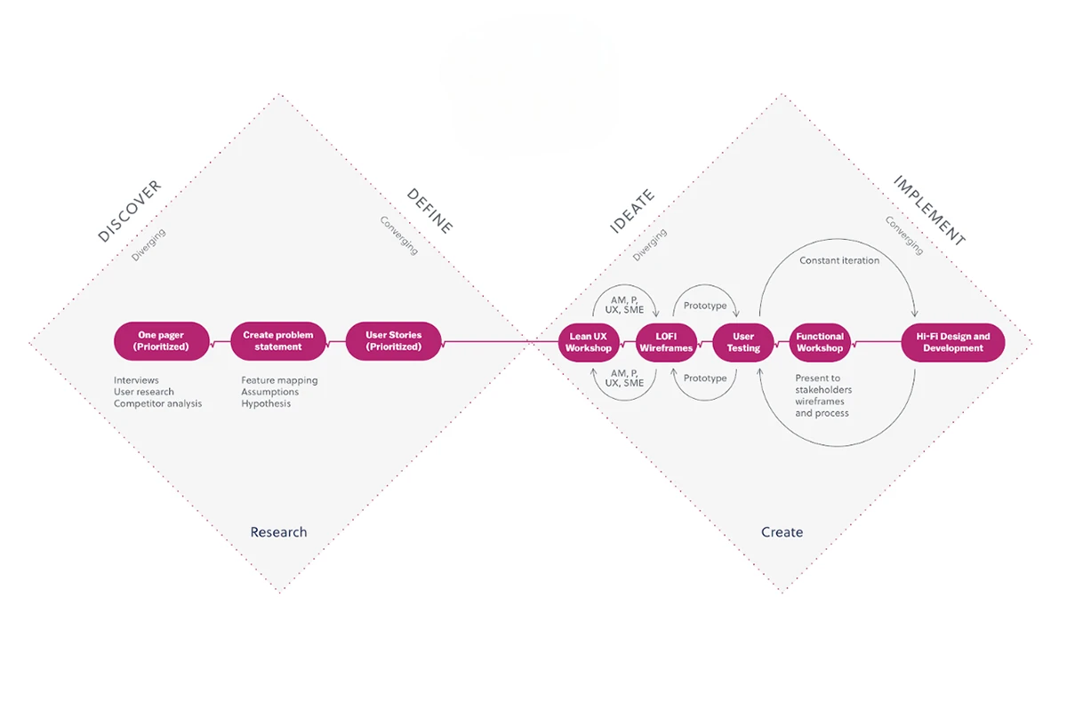
I conducted research interviews with our primary users (account managers) to uncover any pain points that they were experiencing with the beta release.
My research encompassed
Understanding the user goals and needs
Uncovering pain points with the existing user journey
Determining the success of the tasks measured
Gathering insights
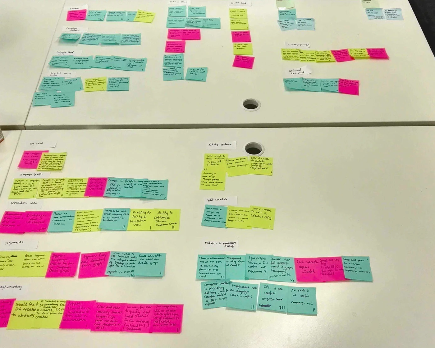
After collecting the recordings from the user interviews, I conducted affinity mapping with my teammate to synthesise the pains identified. We grouped these problems under common themes and features in the platform.
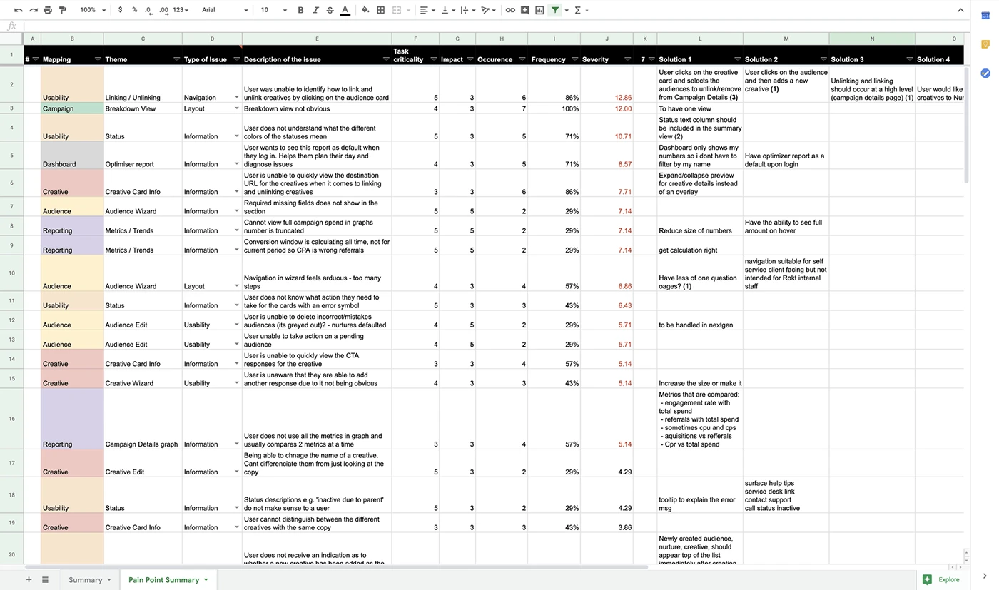
I relied on a data-driven approach known as the severity framework to inform my process and list usability issues in order of priority. The framework helps to identify the severity score of a usability issue based on the following three variables:
Task criticality x impact x frequency = severity
Task criticality - how important is the task to the user? (1 = low, 5 = critical)
Impact - how much of an impact does this issue have on the user's task? (1 = suggestion, 5 = blocker)
Frequency (%) - how many times does this come up out of total participants?
Prioritisation of issues
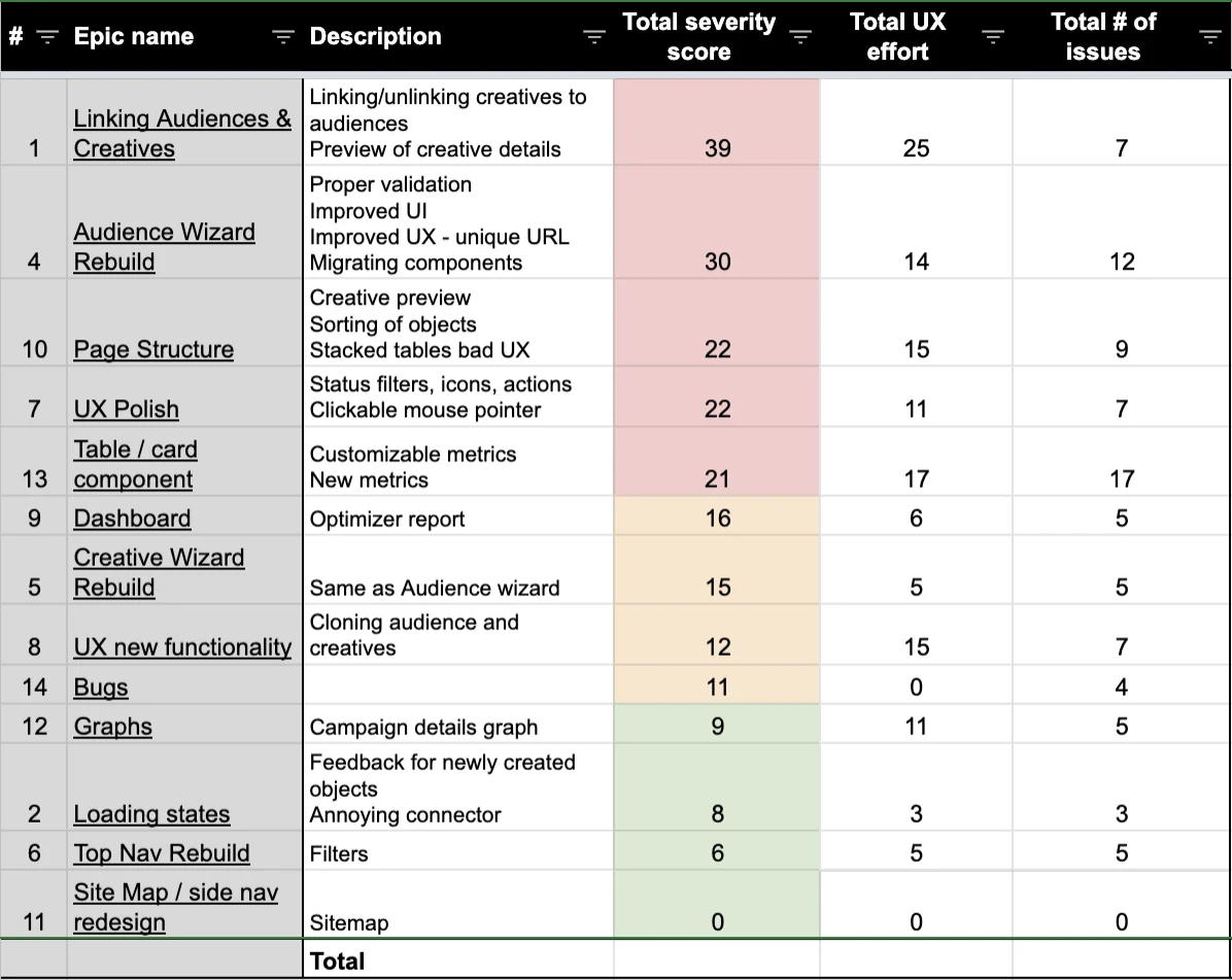
I took the extra step of categorising these problems into broader Epics to provide the Product managers and engineers with visibility into the key areas of the platform that needed to be addressed from a usability standpoint. This not only helped to prioritise usability issues in order of need but also helped to shape the product roadmap for the quarter.
Product, Design and Engineering teams came to the conclusion that the first Epic we would prioritise would be the Audience Wizard due to its severity score, UX and engineering effort required to rebuild it.
Narrowing down the scope of work
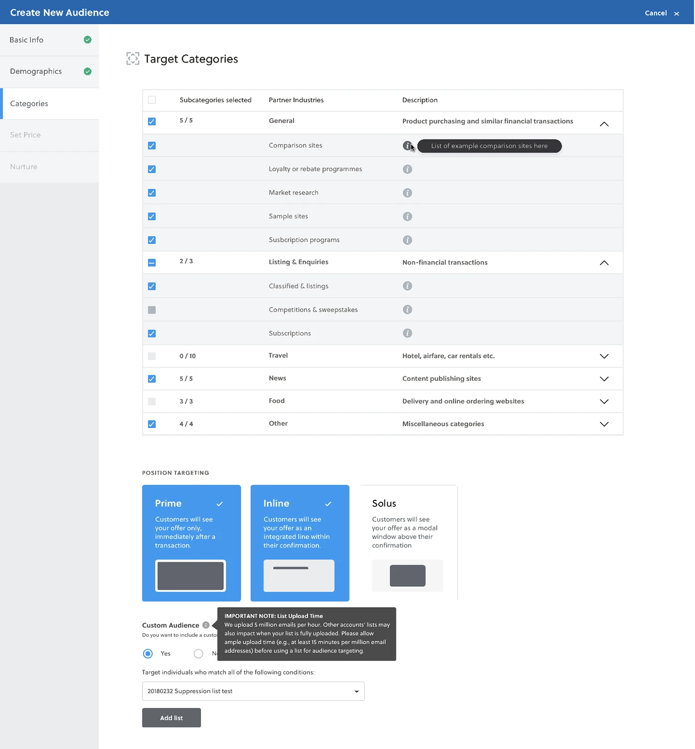
Based on the user interviews conducted with 7 users on the existing Audience wizard, we found the following key issues:
57% of users felt that the process of configuring the wizard was arduous
29% were frustrated that the Next button was disabled so they could not identify which were missing required fields
29% of users found that it was easy to miss field inputs due to a lack of visual hierarchy
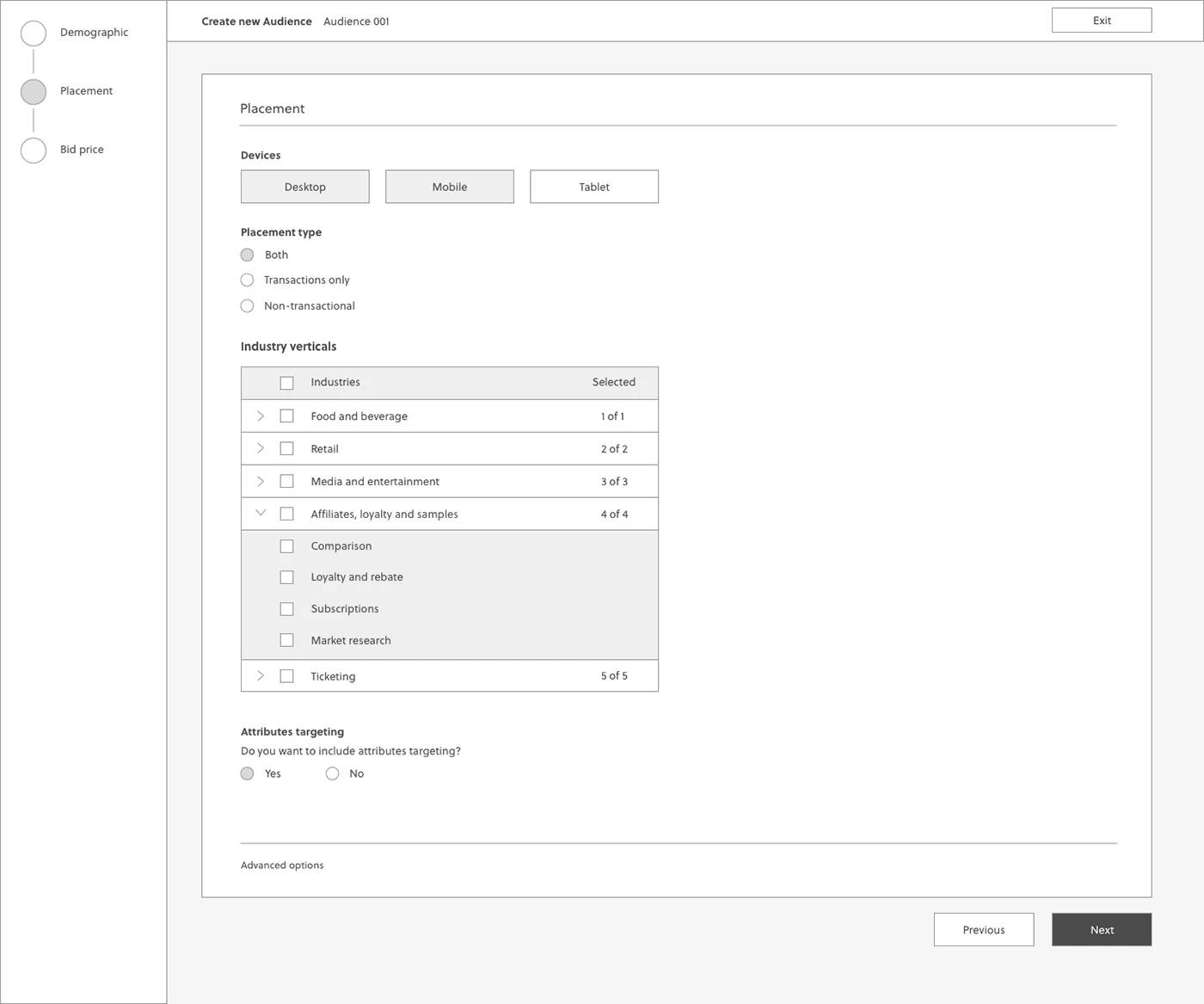
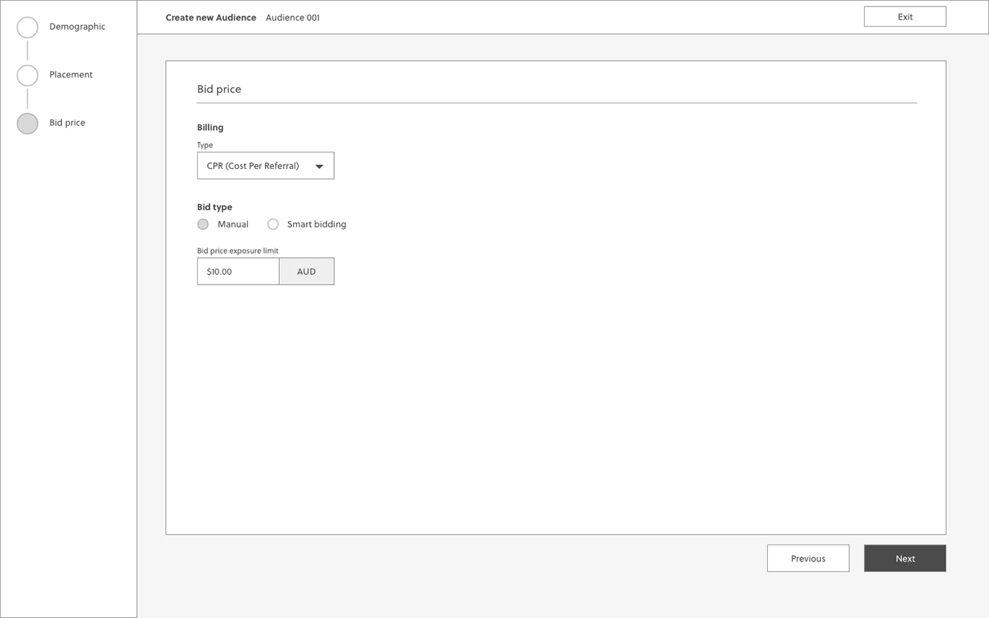
Wireframing the solution
Based on the above problems identified, I worked towards addressing these pains by coming up with potential solutions:
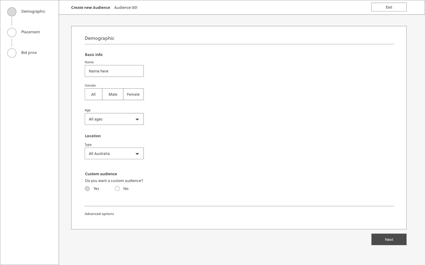
Reducing the number of steps to minimise time to completion
Surfacing mandatory fields and enabling the Next button to show error validation
Establishing clearer visual form hierarchy by grouping related fields
The lack of a formal wizard component also meant that I had to come up with a standardised styling and UI pattern for future wizards
I quickly mocked up some basic wireframes to gather feedback from Product, Engineering and the users on the overall layout and structure of the wizard form. This involved establishing a standardised visual hierarchy and layout for the future wizard component.
Validating the designs
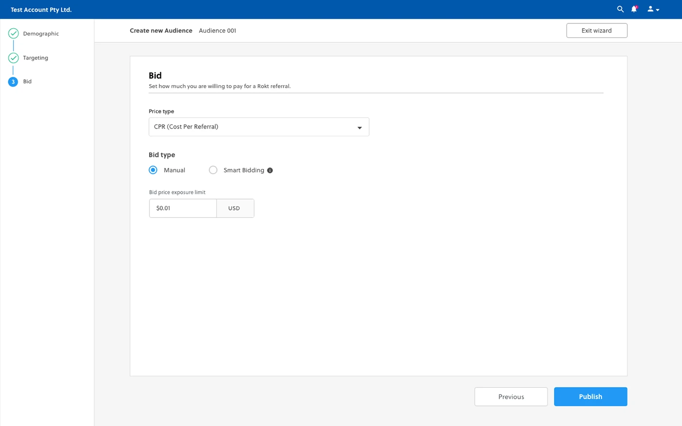
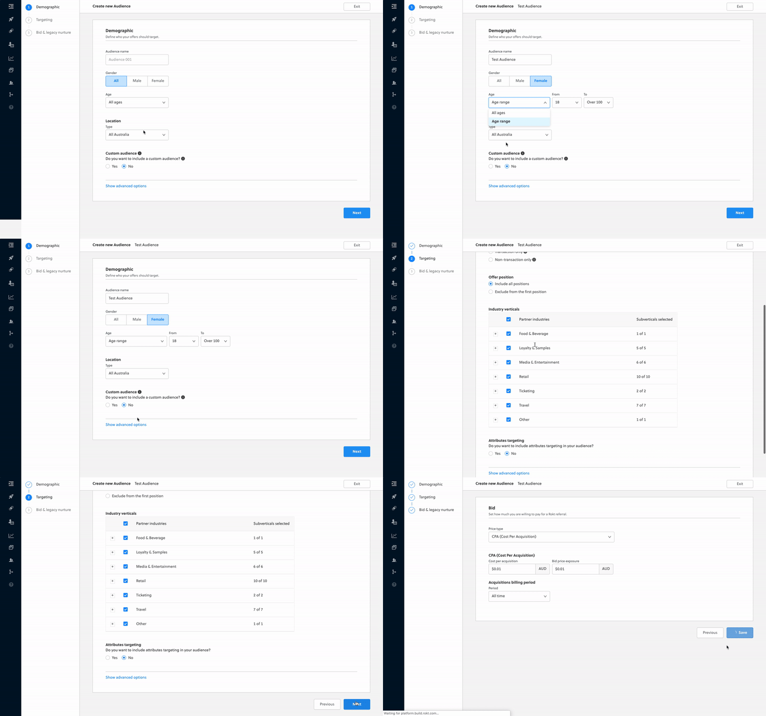
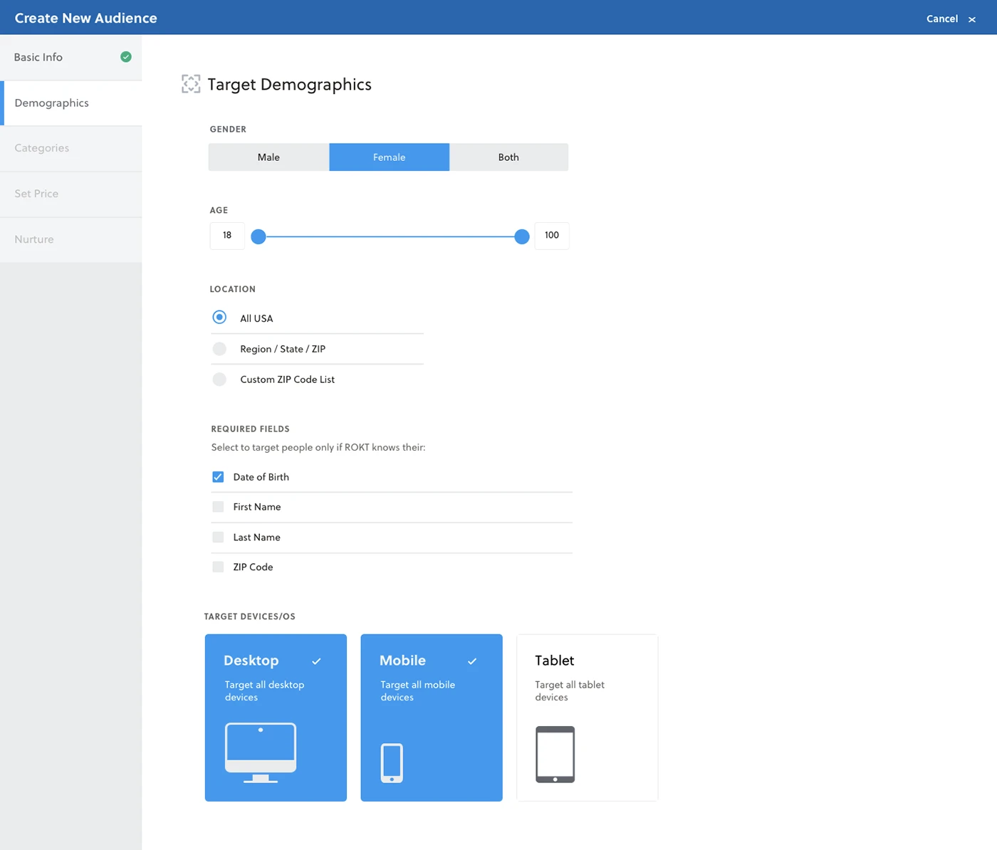
I conducted usability testing sessions with our primary users to validate whether the new designs would solve their problems. I wrote a script including a scenario asking the user to create a new Audience targeting females of all ages on mobile devices with manual bidding enabled.
During the session, I observed how they interacted with the prototype and set up the Audience. The usability session revealed that it was less arduous to set up a new Audience due to the grouping of related fields. It was easier for the user to identify which forms they had to fill, as advanced settings were now hidden under a collapsable toggle.
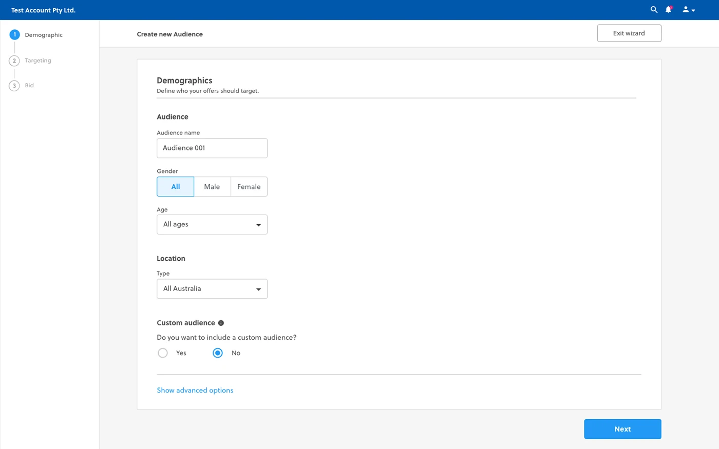
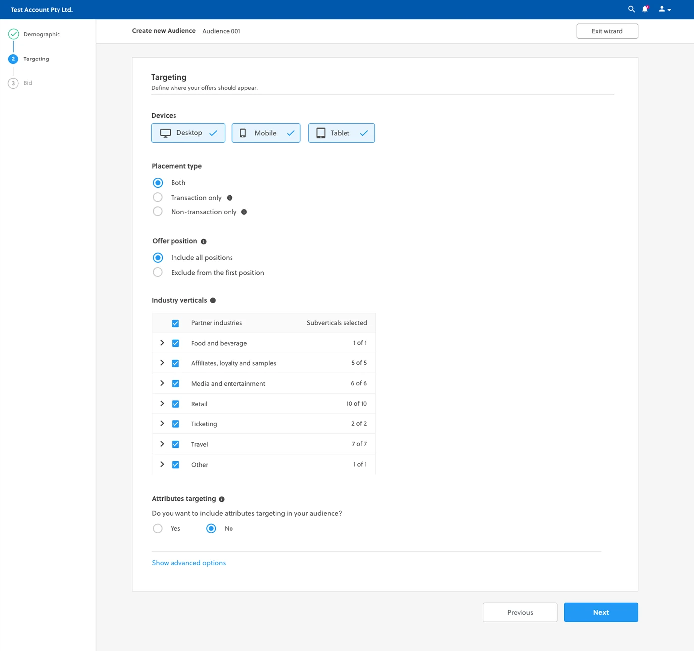
Designs
I worked very closely with the Front End team to spec out any missing interactions that were not covered in the high fidelity mockups. I conducted a UX review of each front-end ticket that was implemented to ensure it was aligned with the designs before it went live.
Results and takeaways
Since the implementation of the new rebuild of the Audience Wizard, we have seen a significant decrease in the number of complaints lodged through the service desk. Additionally, I have received positive feedback from users about the simplified configuration of their Audiences, saving them a large proportion of their time.
Some key takeaways from this project are
Create a strategic plan to launch an MVP.
This helps deal with out-of-scope requests that could potentially derail the project and helps deliver a quality product in time.
User testing doesn't end after development.
Design is a constant iteration of improving the experience for the end user. Always find ways to collect and listen to your user's feedback.
Involve engineering upfront.
This helps to reduce any rework later on as an understanding of the technical limitations upfront will help to inform your design strategy.
Redesigning a new Ad Platform
PROJECT ARTIFACTS
The screens and process, brought into the case.